Supervised Machine Learning - Forecasting Modeling in R
Building a prediction model in R to simulate a time series analysis and projection based on the chronological raw data.
Building predictions and model forecasts are one of the most common challenges in data analytics. Below I am going to simulate a time series analysis and projection based on the chronological raw data.
There are many different forecasting techniques — both statistical and qualitative — and which one you use depends on many factors (value, context, properties, data availability, cost, accuracy, etc).
With that said, one rule applies to most quantitative forecasting methods: the more historical data you can obtain, the more accurate your forecast.
I’m not going to focus here on the business specifics of forecasting — its purpose, components, types, turning points, etc... Instead, I’m going to describe the process and logic for my data prediction approach using R.
Dataset: I’m going to use Google BigQuery public data — github_nested table. And given the available dataset, my task is to project the number of daily repositories for January 2012 based on the chronological 2008–2011 data. We also have data available for January 2012 and I’ll be using it later to check the accuracy of my prediction model after it’s built.
The process for each forecast is similar:
Acquire data
Clean/transform data into numerical properties
Run forecast
Build a plot
Now, let’s go over each of the steps in more detail.
1. Data acquisition
The first step for any forecasting technique is to acquire data. As I stated before, the more historical data you have, the more accurate your forecast.
I’m using RStudio and there are 2 ways to get data:
Export a data sample from the database in CSV or other format and then load it into RStudio OR
Connect RStudio directly to the data source, which in my case is Google BigQuery.
Which way is better?
Given that I’m using R extensively for different projects and want to get the latest data, I prefer the latter — connect RStudio directly to the database and then run SQL against it. That being said, the former method would be faster and simpler for many similar forecast projects.
In order to connect to the Google BigQuery, I am using the bigQueryR package.
{r Acquiring dataset, echo=FALSE} library(bigQueryR) bqr_auth() #Authenticate to Google BigQueryAnd then I run my SQL to get the right dataset. According to our task, we need to forecast the number of git repositories for January 2012. So let’s get all created repositories per day:
dataset <- bqr_query("driven-strength-147321", "samples", "SELECT DATE(repository_created_at) as day, count(distinct(repository_url)) as cnt FROM [bigquery-public-data:samples.github_timeline] WHERE repository_created_at IS NOT NULL GROUP BY 1 ORDER BY 1 asc")2. Data cleaning
The second step is to transform our data into the right format. Building predictions requires you to have 2 columns: one in date format (timestamp) and one numerical (integer).
We also should check that our dataset doesn’t contain NULL values, missing rows, etc.
tmpv <- c(head(dataset$cnt, 1000), rep_len(NA, length.out = length(dataset$cnt) - 1000))dataset$pre <- tmpvrm(tmpv)3. Running forecast
And now comes the most important part! With clean data, we can proceed to build the forecast. I’m using the R library(forecast).
We needed to forecast the number of git repositories for January 2012. So, let’s extract the dataset we have until January 2012, add another column for prediction and run the forecast using the Arima model:
library(forecast)##Attaching package: 'zoo'## This is forecast 7.3#fit_arima <- auto.arima(dataset$pre)#f_arima <- forecast(fit_arima,h=24*14, level=80)#plot(f_arima, maing="fart prediction", xlab="time", ylab="users", type="l", axes = FALSE)#axis(2,cex.axis=1)fit_ets <- ets(dataset$pre)f_etc <- forecast(fit_ets, 250, level = c(30,50))4. Plot forecast
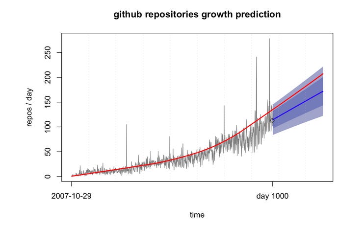
The favorite part of using R is building these beautiful plots. Okay, they can be beautiful. Below is a simple quick plot using ETS:
Summary
This is just an example of my logic and steps for forecasting modeling in R. As we can see, the data we predicted (blue line) follows the pattern and is within the ranges for the real data GitHub provided (red line) for January 2012. This tells us that the model we applied is correct.


