
From Numbers to Narratives | Chris Dalla Riva
Interviewing Chris Dalla Riva: Numbers, stories, and the craft of data journalism


Welcome to the Data Analysis Journal, a weekly newsletter about data science and analytics.
If I could choose any new analytics path for myself, it would be data storytelling, without a doubt. Data storytelling combines data analysis with design and communication. Dry numbers become clear and compelling stories, both visual and non-visual.
I’m especially drawn to data storytelling because it’s a skill I’ve always lacked. As a typical data person, I think in structures and tables, so my writing often ends up dry, full of lists and bullet points, and hard to read. That’s just how my brain works. Honestly, I’ve never been able to write seamless stories like
, Casey Newton, or - or like one of the best data storytellers out there, Chris Dalla Riva, whom I recently had the chance to interview.Chris is a musician, data analyst, and writer. He lives at the intersection of music and data, focusing on analytics and personalization. He writes the popular newsletter Can’t Get Much Higher and has been featured in The Economist, Business Insider, and NPR, among others. He also just published a book, Uncharted Territory: What Numbers Tell Us about the Biggest Hit Songs and Ourselves, where he presents a data-driven history of popular music in a way that’s both fascinating and accessible.
Below, I’m sharing my interview with Chris on how to become a data storyteller: how to develop an “eye” for stories, what skills and tools to focus on, and how the field is evolving. You’ll notice how easy his writing is to follow and how naturally he draws you in. I’m absolutely fascinated by how he communicates in such an engaging and welcoming way.

Can you share your story of how you got into data journalism and what fascinates you about it?
Looking back, it makes sense that I would try to do something with data journalism. I studied mathematics and economics in college. I always had an interest in writing. I loved learning about music and culture in my free time. But actually getting into data journalism was kind of an accident.
Years ago, I pitched a story to a website called Tedium about how there were fewer key changes in popular songs.I thought it was quite niche, but it ended up going mega-viral, leading to me appearing on NPR and in The Economist. That made me realize that people might be interested in what I had to say. So, I decided to start up a newsletter where I could write about music and data every week.
I feel like that key change story is a good example of why I like data journalism. I always felt like there were fewer key changes in songs these days, but data makes it possible to check. Often what frustrates me about certain stories – in music or not – is that claims are made that could easily be verified. Of course, there are limits to what data can do as some things are not easily measurable, but I think it’s nice to try to measure things when we can. It at least gives us a firm starting point from which we can agree or disagree.
How do you define data journalism, and what are some typical examples of it?
For me, data journalism is any form of reporting or analysis that includes something quantifiable. Of course, that includes people using sophisticated statistical methods, like you might see Nate Silver or other political pollsters do, but it also includes much simpler things, like surveying 100 people about some topic and reporting on the results.
Sherwood News has a lot of great examples of the former. For example, here is a short piece they did on drinking habits in the United States. If you know what a percentage is, you can understand this piece. Still, it’s very insightful. I think people assume that to be worthy of the moniker “data journalism” a piece must be complicated. I don’t think that’s the case. In fact, I think data is supposed to make things clearer if used correctly. Most of my pieces are just using sample means and ratios.
When I think of great data journalism, here are a few pieces that come to mind:
Unraveling Florida Man: The Meme, The Myth, The Legend. A Statistical Analysis.
Elon Musk’s Hard Turn to Politics, in 300,000 of His Own Words
John Snow's data journalism: the cholera map that changed the world
What are the biggest challenges you face in your work?
My biggest problem is getting data. I know many data journalists who find existing datasets and build their reporting about what they can mine from those datasets. Of course, I’ve done this too, but I typically start with a question and have to figure out how to get the data to answer it. Sometimes this results in me scraping Wikipedia and pairing that scraped information with data pulled from Spotify. Other times, like in my book, it requires monitoring hundreds of terrestrial radio stations.
Sometimes there just isn’t data available, though. For example, a friend of mine has this theory that children of divorce are more likely to pursue careers in music, with a particular concentration in punk music. I think it’s a great theory. And my gut says it’s true. But it’s really hard to find divorce data that can be paired up with popular musicians. Sometimes the biggest challenge is knowing when you shouldn’t weigh in on a topic because the data doesn’t exist.
How do you choose topics or themes for your analyses?
If I am not truly interested in a topic, I usually can’t bring myself to write about it. (The nice thing about writing for yourself is that you don’t have to write about things that don’t interest you!) But the way that I find things that interest me come from many places.
Sometimes I get a topic from a friend or coworker, like when my coworker asked me who the greatest two-hit wonder of all-time was. Other times, I’ll give my take on a prominent news story, like when an AI band got millions of streams on Spotify. That said, most of my topics come from a little notebook that I keep on my desk. Whenever something vaguely interesting strikes me, I put it in there. Then every Sunday or Monday, I pick one to write about. Some that are in there now are the following:
Which US state has the best musical Mt. Rushmore?
How have the songs played at funerals changed over the decades?
Did Guitar Hero impact the musical tastes of a generation of people?
Have the colors we see on album artwork changed in the last 20 years?
Feel free to steal one of these ideas if you’d like. I’ve got too many things going on and will probably never get to them.
What has been your favorite piece of coverage or analysis so far?
If we are talking about my favorite pieces that I’ve done, the number one spot has nothing to do with analytics. Basically, my grandmother would always claim that Frank Sinatra performed at her high school while she was a student there. She was a straight shooter, so nobody had any reason to doubt her, but it was quite the claim. After she died, I wanted to see if there was any evidence that the show happened. So, I went on a long quest looking for proof. I spoke with Sinatra experts, dug through newspaper archives, and bothered more than a few strangers on Facebook. I won’t spoil the ending, but it was quite a journey.
Anytime I meet someone that has read my work, this is always the piece they bring up. I’ve always found that interesting because it’s so different from my normal data-driven pieces. At the same time, I think my training in data analytics made this investigative piece easier. Data journalism is all about sleuthing through sources, albeit those that are often numeric. But those sleuthing skills are applicable in many other domains.
What is your upcoming book about?
In 2018, I decided that I was going to listen to every number one hit song in history. Part of this decision was driven by my interest in music. I loved playing in bands and writing songs. But another part was driven by desperation. I was working a stressful job that I didn’t like. 3-minutes with a song at the end of each day was a reprieve from my day-to-day life.
Given that I’ve always worked with data, I started collecting tons of information about each song. Which label released it? What was the gender of the songwriter? Was the song entered in the Eurovision contest? From this ever-expanding dataset – which is now publicly available here – I started noticing some trends. Inspired, I wrote some stuff up about what I was seeing.
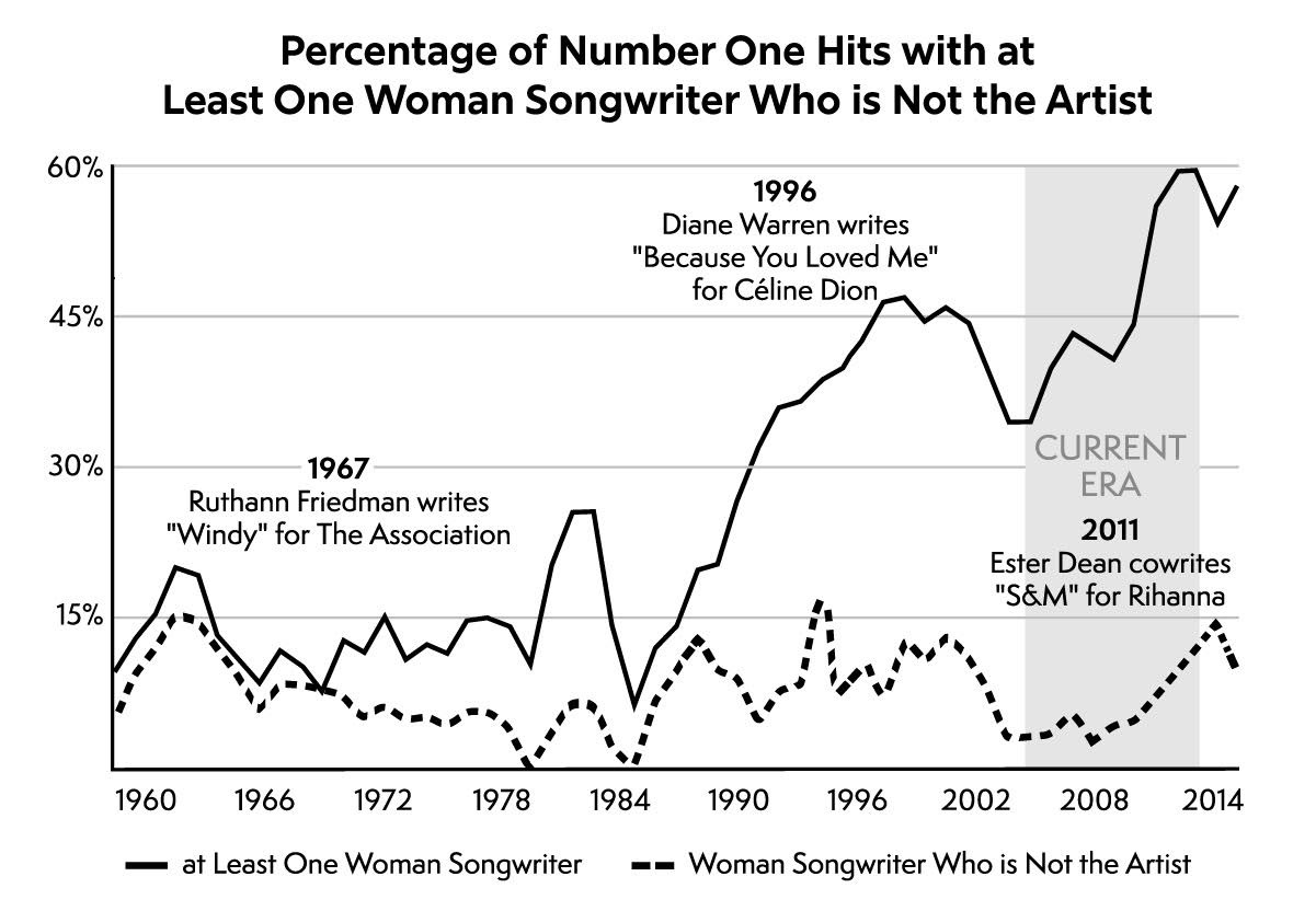
These stray observations slowly evolved into a data-driven history of popular music covering the period from 1958 to 2025. It’s called Uncharted Territory: What Numbers Tell Us about the Biggest Hit Songs and Ourselves. It’s packed with great visualizations made by my friend Caileigh Nerney, like the one you can see below.
Can you walk us through your process for creating data-driven analyses? What tools or software do you use, and how long does it typically take?
I’ll give you an example from a piece that I wrote. Everything starts with a good question. In this case, my question was simple: what is the most underrated song of the 1980s? From a question, you need to figure out how to measure what you are looking for. In this case, I decided that a song is underrated if there is a big difference between critical and popular perceptions, meaning critics loved a song much more than your average person.
With a methodology, you then need data. In this case, I used Spotify stream data to proxy popularity and average song rankings from 7 critical lists to proxy greatness. I then compared them to get the results I was looking for. As in most cases, I manipulated the data with Microsoft Excel and Python’s Pandas analytics package. I then visualized with Data Wrapper.
End to end, this piece took me a couple of hours across two days. My typical timeline is that I start writing on Monday and publish on Thursday each week. Occasionally, I start a piece earlier if I need more time, but I generally work fast and stick to a publication schedule.
How do you see data journalism evolving, and what might it look like in the future?
In the last 15 years, data has come to touch basically every aspect of journalism in some way. As things continue to move online, I think our world will become more quantifiable. I expect data analysis will become an even more fundamental skill for many parts of the writing process. I also expect this writing to be more interactive, like the style pioneered by The Pudding. If you’re unfamiliar, I did a piece with them about quantifying the greatest album of all-time. I also really loved this piece they did about the evolution of the literary canon.
What skills or qualifications do analysts need to succeed in data journalism?
While I always tell people that it’s good to have a working knowledge of statistics and the ability to write some code, especially in Python and SQL, I think the most important skill in being an effective data journalist is the ability to perform rote tasks without losing your mind.
That probably sounds crazy. But even in our highly automated world, so much of data analysis is data cleaning. You’ve got to be willing to get down and dirty with your data if you want to find interesting insights. Sometimes that requires writing a few lines of SQL. But other times it requires building and cleaning lists of thousands of television theme songs from Wikipedia, like I did in a piece a few years ago. It’s not as sexy as running regressions, but I think it’s where the deepest insights lurk.
Is there anything else you’d like to share to inspire people to learn data or pursue a career in this field?
If you have a question that you want answered – with data or not – don’t be afraid to start searching and publish what you find online. 99% of opportunities I’ve had as a data journalist have come because I sent a cold email to someone who I never thought would reply or because I started publishing my thoughts before I was technically ready to. Don’t be afraid to shout into the void. You never know who is listening.
Thank you, Chris!
Find Chris:
 | A guest post by
|
Thanks for having me! This was a ton of fun. For anyone reading, check out my forthcoming book “Uncharted Territory: What Numbers Tell Us about the Biggest Hit Songs and Ourselves”