
How to Create Decks That Don’t Suck - Issue 245
Or why we all hate PowerPoint - and how to make presentations that don’t make people hate you

This publication is dedicated to my team of analysts, all of whom sent me their decks over the past few weeks. Rather than reviewing each deck individually with my usual - “Love this!”, “Please never do this,” “This should be illegal,” and “Remember these 10 PowerPoint rules” - I’ve decided to share my thoughts in a single publication for all my subscribers.
PowerPoint presentations are one of the reasons we dread our jobs. No one enjoys making presentations. Unfortunately, the more senior and experienced we become, the more decks we have to create. There’s no escaping it.
In analytics, presentations are the most common output of our work. While they should (and must) be supplemented with a notebook, Excel, or a dashboard, decks remain the primary format for data storytelling when communicating with executives, the board, and stakeholders. We create board decks, monthly and weekly KPI reports, deep dives, investigations, roadmaps, proposals, A/B test readouts, retros, and all types of analyses. I typically have to create around 8–10 decks per month, and I struggle with each one. That’s how sad my life is.
So today, I’ll cover the dos and don’ts of creating decks, best practices, and common mistakes analysts make. Some of these are foundational data storytelling principles that we must follow, whether we like them or not, while others are personal learnings and recommendations.

Presentations, as an output of our work, effectively reflect our seniority and experience. The more junior a person is, the more slides, data points, narratives, and context they include in a deck, often making it overwhelming and unreadable.
It takes so much experience and knowledge to cram a month of work and insights into one small slide. Only one slide to illustrate correlation analysis, Y/Y user growth, seasonality patterns, revenue forecasting, or other projects you spent a lifetime on. Developing this skill requires training and practice, and 99% of analysts, including myself, struggle with it.
That’s why many companies still require candidates to create a deck as a take-home exercise when hiring. You can’t fake expertise with a deck. Your experience is reflected in the title, subject lines, colors, number of words used, number of slides, charts, references, etc. AI can only take us so far, and most AI-generated decks I’ve received are cringy and miss the mark.
So, what’s the best way to condense one slide in a way that would be easy to read, simple, and tell it all - the story, the context, the pattern, and the impact. How can one do it?
Learning from the Best
My biggest weakness is data storytelling. I’ve noticed that this is the case for many analysts. We focus so much on data and nuances that, naturally, every detail feels essential, every stat is important, and deciding what to “cut” or “keep” is never easy.
To make matters worse, I personally enjoy bold colors and prominent legends. I still don’t understand what’s wrong with having a bright orange bar next to a royal blue bar in a vertical chart with pink, bold, overlaying legends 🔥. Apparently, this is considered tasteless and distractive:
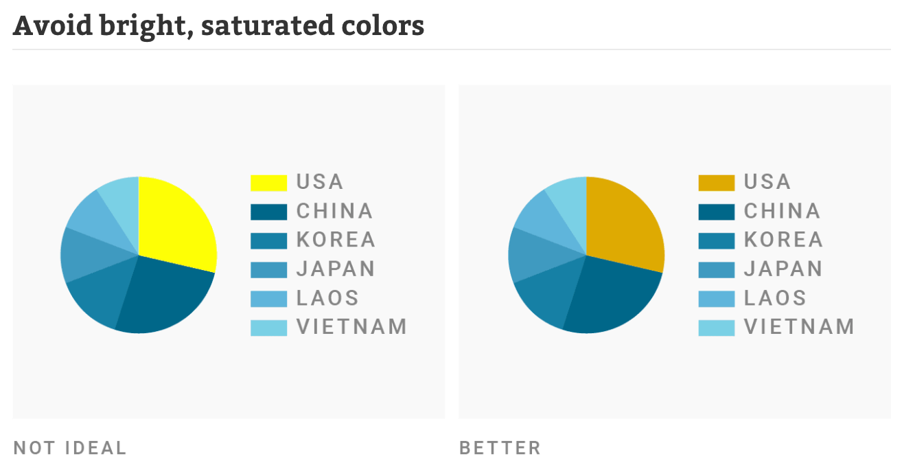
That’s why, if you’ve noticed, my newsletter includes over 50 publications dedicated to charts and visualizations - to override all my instincts. It’s also why I am always on the lookout for effective storytelling practices - I don’t trust myself one bit.
My list of experts on data storytelling:
The recommendations I share below are adopted from analysts, visualization experts, and presentation coaches:
For KPI reports, board decks, or financial data, I use Bill Binch reports. Bill is an executive coach and board advisor who has spent his career in board meetings, so I use his examples when creating decks for the board and executives.
When creating charts for the deck, I adopt methods shared by Adam Frost and Tobias Sturt, who teach Guardian Masterclasses in data visualization and share their practice at must-read AddTwo.
For revenue data, subscriptions, and SaaS analytics, I adopt Christoph Janz’s frameworks and examples. Christoph is an investor, advisor, blogger, and famous SaaS expert. If you want to learn more about SaaS analytics and reporting, you should definitely read his articles. Christoph is a Managing Partner at Point Nine Capital and is behind such products as ChartMogul and Brightback - both famous subscription analytics platforms.
For the deck structure and design, I follow Andrew Abela, founder of the ExtremePresentationMethod and author of Advanced Presentations by Design: Creating Communication That Drives Action. His publications are spot-on charts, slides, decks, dashboards, etc.
Thomas Schmidt, a fellow data scientist, has shared the best practices of data storytelling from Metabase, Shopify, and DeepL in his recent guest post, How to Communicate Data Effectively.
Lastly, I borrow slide examples from my favorite data storytelling newsletter, Chartr, which was run by a small team of 7 people before being acquired by Sherwood Media last year. It still remains the best data visualization media product out there.
Processing all of this, here are my key takeaways for crafting presentation decks.
