It’s Wednesday, and I’m back with another edition of the Data Analysis Journal for you to explore news, events, insights, and resources in the data analysis world.
✨ Today we will be discussing:
A focus on data visualizations: best practices, tips, and methodology to choose the right chart for data storytelling.
Google announced interesting ML and AI enhancements to its search engines.
Open internship position for Product Growth Analyst.
Want to know more about a specific subject that hasn’t been covered yet? Please fill out this survey to help me better understand how this journal can bring you the most value.
Let’s get started!

📚 Weekend Longread
If you enjoy data storytelling and want to get inspired by different visualization projects around the world, check this Reddit which gathers together all topics related to visualization, the design of graphs, charts, maps, etc.
Some interesting highlights from /r/Visualization:
🔥 What’s new this week
The big news last week in the data world - Twillio acquired Segment, a San Francisco-based cloud data infrastructure company, for $3.2 billion. Segment is, in its own way, a very sophisticated CRM. Its main draw is the capability to unify multiple data pipelines. I’m definitely curious to see how Twillio+Segment will work together to improve customer analytics.
Want a quick way to evaluate and optimize your SQL queries? Behold! SQLbench. It measures and compares the execution time of one or more SQL queries (only PostgreSQL is supported at this point).
A few days ago Google announced a range of AI and ML enhancements to its multiple products for search engines, including spelling corrections, passages, subtopics, COVID-19 info, deep video semantics, 3D, and more. Now you can search for songs on Google by just humming! You have to sing for 10-15 seconds for its AI to pick it up. If you're the type of musically-inept person who can't even hum a tune right, however, then it sounds like not even Google can help you. Good luck…
If you are using Elasticsearch, you will appreciate some new functions which were just added last week, like aggregations on strings, histograms, boxplots, and pipelines. Aggregate all the things.
🏆 Nailed It
Be prepared for your next interview
Let’s focus today on visualizations. Visualizations are an important part of any data storytelling. These can be simple graphs or interactive data visualizations, multiple dimension views, maps, or animation. The biggest challenge with picking the appropriate data chart is to present the value in the most easily recognizable way.
To start with visualizations, you have to understand what type of problem you are describing or what are you trying to find in your data. Based on your data problem, you have to decide between 4 different graph categories:
Comparison and Ranking
Relationship and Correlation
Distribution and Evolution
Composition and Flow
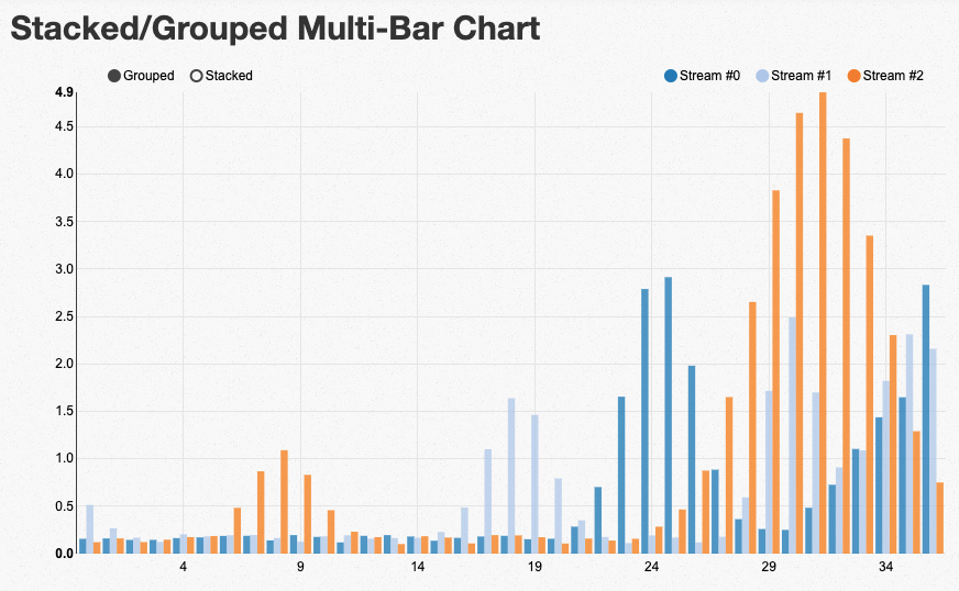
Comparison and Ranking is the most common type of visualization for data storytelling. You can compare events over time or with each other. These are table charts, columns, and bar charts. Over time comparisons include line charts. You would use ranking or comparison charts to show the lowest and highest values in the data.
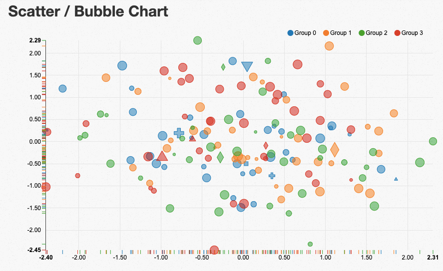
Relationship and Correlation visualizations can have two or more variables and the best representation would be done via scatter or bubble chart. You would use these to show clusters of data, outliers, or correlations.
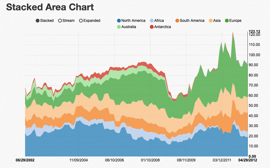
Distribution and Evolution charts work best for representing quantitative values. This chart choice also depends on how many variables you have. These can be histograms (column and line), scatters, box plots, or 3D area chart (for 3 variables).
Composition and Flow visuals can be static and dynamic. Static charts are waterfall graphs, pie charts, and stacked column charts. Dynamic depend on how many relative differences you aim to display for how many periods of time. You would use this type of visualization to see the relative value or absolute difference - either percentage of total or value of total.
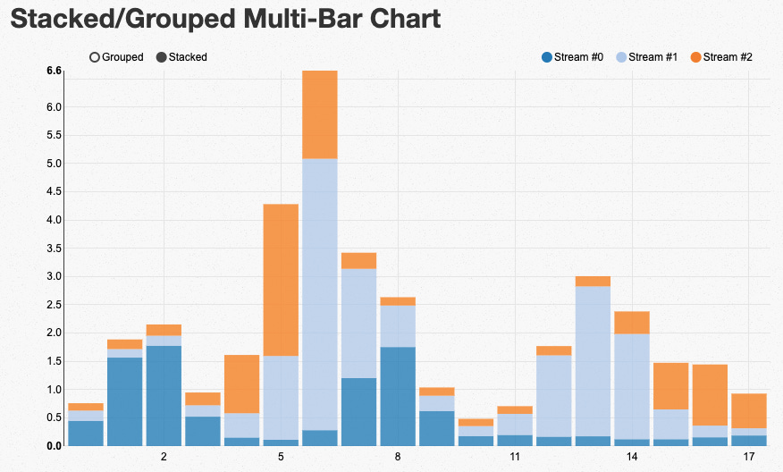
Images are taken from here.
Follow this guide below to pick the right visual for your story:
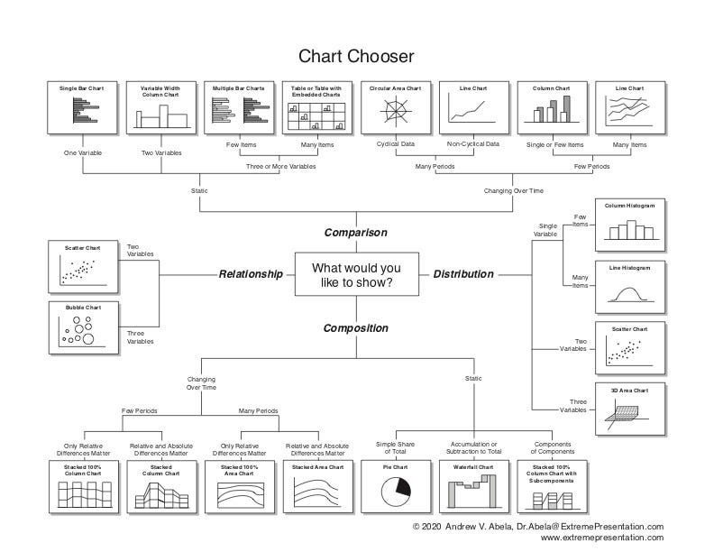
Taken from here.
My recommendations for the best practices for data visualization:
For displaying negative numbers or comparing 10 or more items, use a bar graph instead of a column chart.
Don’t use pie charts for more than 4 categories. Use a table instead.
For continuous data, avoid plotting more than 3-4 lines in a line graph.
If you are working with multiple datasets and have different variables, instead of multiple charts, you can make one dual-axis chart with 1 X-axis and 2 Y-axes. For example, you could combine a line chart and a column chart in one graph to show the relationship between different variables.
Use colors to convey a story (green/red - good progress or slow). Avoid bright saturated color choices. Read an amazing guide on how to pick more beautiful colors for your data visualization.
Check these examples of the best and successful data visualizations:
Job Market Tracker from WSJ. Very easy to read and intuitive. Smart use of colors and scale.
Coronavirus tracker from San Francisco Chronicle. Simple and clear graphs without any additional noise or labels. Smart use of dual-axis charts that I mentioned above.
Another amazing set of interactive visuals - Simulating an epidemic.
Get inspired by the gallery of most latest sophisticated 3D charts.
YouTube Trending Videos Analysis - a thorough deep-dive in Python with great visualizations.
To read more about data visualizations to know how to differentiate them and learn how to make plots and graphs in Python or R.
🎓 Level Up
Certifications, internships, schools, and courses.
Heads up! There’s an open internship position for Product Growth Analyst at NPR, a mission-driven multimedia organization for winter/spring 2021 (fully remote).
🍸 Drink and Mingle
Upcoming free events, meetups, talk, webinars
Oct 21, ProductBoard: Product Excellence Summit 2020
Oct 22, Introduction to TensorFlow-Hub
Oct 22, Galvanize: Software Engineering or Data Science?
Oct 22, Oracle&Netsuite: Q&A Q&A with Netsuite consulting
Oct 28, Anaconda: Working with Data in the Cloud
Oct 28, DSS: Credit Risk - Why Model Fairness Is Needed
Nov 12, DSS: Become a Data Science Superhero with Python

🙏 Do Some Good.
It pays back.
I have a favor to ask. As my audience grows, I’d like to better understand how this journal can stay interesting and help you to become a better data analyst, data scientist, and progress in your career. I’d appreciate it if you could take a moment to fill out this brief survey.
Thanks for reading everyone ❤️. Until next Wednesday!


