
How To Accelerate Data Reporting With Automation
A step-by-step guide on how to automate and leverage your reporting for better decision-making - a guest post by Britton Stamper, co-founder of Push.ai

Welcome to my Data Analytics Journal, where I write about data science and analytics.
This month, paid subscribers learned about:
SQL And Python Mistakes To Avoid - where I grudgingly share some painful lessons I learned from my own errors made while working with SQL and Python.
A Deep Dive into Onboarding Flow Redesign Analysis - I put together everything I learned so far about re-designing and analyzing user onboarding into a guide with benchmarks, process, metrics, testing paywalls, and the expected unexpected.
Statistics 101: When Simple Becomes Tricky - There is no excuse for failing to replicate basic functions during your data science interview. I break down variance, standard deviation, mode, median, and distribution to prepare you for what you will be asked to explain.
As you probably know, I am not a fan of meetings. I believe standups, check-ins, weekly KPIs readouts, and project status updates are redundant. They waste everyone's time and could be replaced with smart, efficient, and automated reporting.
I was exploring automated ways to share weekly KPI reports and ran into Push.ai, after which I immediately fell in love with their report builder. I liked their metrics monitoring, visuals, and simplicity. So I reached out to them and met with Britton Stamper, analyst, data storyteller, CTO, and co-founder of Push.ai. After a fun convo about semantic layers, Periscope (I used to be a fan), and learning more about push.ai, I asked Britton to share their approach and industry best practices to report automation. He agreed to write for me, and today I am so excited to present my third guest writer who walks us through the process, tooling, and steps on how to automate and streamline data reporting.
How to accelerate your data reporting with automation by Britton Stamper

Reporting is one of the core deliverables for data analysts. However, the most common solution of manually creating reports can be time-consuming and leads to inconsistencies. Data analysts often get caught in a trap of updating the same set of reports every month, copying data from source systems into documents, spreadsheets, or slides. Even if manual reporting has been optimized to take as little time as possible, there is a high chance it can introduce errors and discrepancies.
My first job out of college had 3 distinct sets of eyes checking all the analytics and reporting in case someone had mistyped a number of copy-pasted poorly from the source system. Eventually, manual reporting becomes a bottleneck as data analysts want to increase the impact they bring to their organizations.
In this publication, I will share how to get started with automating reporting and setting up the systems so that data updates and distribution can be automated. By the end of this, you should be able to see your own path to create consistent, automated, effective reporting.
Getting started - define measurements, dimensions, and metrics
The first step in automating reports is to align with key stakeholders on what data they need and how they would like it transformed from the source systems into metrics they want reporting on. Data used in reporting fits into one of three categories:
1. Measurements: Important aggregations of data that business teams care about (e.g. Order Count or Revenue)
When defining measurements, dimensions, and metrics, strive for clarity and consistency. The key assumptions, data sources and update frequency (SLA) should be written out so that everyone agrees on the data in reports. This process can be written out as detailed descriptions in a shared document. This keeps stakeholders involved and aligned on the outcomes of a report automation project.
2. Dimensions: Data used to group measures into categorical information (e.g. Customer Segment or Product SKU)
One particularly important type of dimension is the time dimension. Reports are usually time-based, set up on some cadence such as weekly or monthly, to allow teams to analyze changes in measurements over time. Combining a measurement with a specific time dimension allows teams to define metrics.
3. Metrics: A measurement over time, often used to track progress (e.g. Order Count by Created Date or Customer Count by First Payment Date)
This may sound simple, but it is the most commonly overlooked step in creating automated reporting. First, teams need to establish when a particular measurement is significant for the business. If we take an e-commerce business, is the revenue recognized when an order is created, when it is shipped, when it is delivered, or when the return policy has passed and the revenue cannot be reversed? There is no universal standard yet for metric definitions so teams need to make the measurement and time dimension relationships clear by documenting the metrics that matter to their organization.
One additional place where the teams we work with struggle is getting the time dimensions to align for reporting. The most common type of time dimension confusion comes with conversion metrics. If a team is reporting on the conversion for an activation rate, such as a 7-day activation rate where the metric is only valid after 7 days from the user’s created date, then the time dimension must be translated to align with the conversion rate definition. This can be done by using a date_add() or + interval ‘7 day’ function in SQL:
SELECT
  (created_at::DATE + INTERVAL '7 days') as shifted_cohort_date,
  COUNT(user_id) AS cohort_size,
-- Using conditional aggregation to count users who converted within 7 days
  COUNT(CASE WHEN DATE_PART('day', converted_at - created_at) < 7 THEN 1 END) AS converted_users,
  (COUNT(CASE WHEN DATE_PART('day', converted_at - created_at) < 7 THEN 1 END)::FLOAT / NULLIF(COUNT(user_id)::FLOAT), 0) AS seven_day_conversion_rate
FROM Users
GROUP BY (created_at::DATE + INTERVAL '7 days')
ORDER BY (created_at::DATE + INTERVAL '7 days')
Common Report Calculations
Report calculations can be simplified to some basic queries that perform time aggregations. These queries either GROUP BY time dimension or use the time dimension in a filter like WHERE date BETWEEN start AND end. By aggregating by time or comparing similar periods, teams can understand how metrics are changing and make more informed decisions.
Common calculation types are:
Intraday:
Hourly: Useful for operations that need near real-time insights, such as monitoring web traffic or e-commerce operations.
Minute-level: Useful in scenarios like high-frequency trading or ad bidding where every minute matters.
Periodic (Daily, Weekly, Monthly, Quarterly, Yearly):
Prior Period: The last complete period's data.
Period Over Period: Compares data from one week to the previous week.
Period to Date: Cumulative data from the start of the current period up to the current date.
Rolling or Trailing Periods:
Trailing 7 days: The past 7 days, excluding today.
Trailing 30 days: The past 30 days, excluding today.
Rolling 12 months: The past 12 months, including the current month.
Custom Periods: Depending on specific business needs, data may be aggregated for any custom time period like the last 10 days, last 6 months, etc.
Seasonal: Comparisons made for specific times in a year, e.g., Christmas season, back-to-school, or summer months. This helps in understanding seasonal trends and patterns.
Event-based: Aggregating data around specific events, like a marketing campaign, a sales promotion, or major global events like the Olympics.
Time analysis is easy to perform in SQL. In the first query below, we pull the periods over time by truncating the date into a useful calendar period like month or week. In the second query, we create a custom set of date expressions that can be unioned together, where the start and end dates create the two comparable periods.
Creating periodic time series data:
select date_trunc(date_field, ‘week’) as period,
  {aggregation}
from …
group by 1
order by 1 desc
Creating period comparisons:
select {metric}
from …
where date_field between recent_start_date and recent_end_date

union

select {metric}
from …
where date_field between prior_start_date and prior_end_date
The first query allows teams to perform time series analysis, usually displayed in a chart or table. If metrics have been defined clearly, the charts or tables should all line up. For reports that show many metrics, it's best to either display them in a single table or a series of charts, where no chart has more than one or two metrics.
The second query allows for a wider range of comparisons, such as current week-to-date versus prior week-to-date, and can be used to tailor reports to individual report needs. A team can use the week-to-date comparison to understand the pacing of their current week’s performance against the prior week’s.
Agree on the Report Wireframe and Formatting
As teams start to automate reporting, they need to start implementing a consistent structure. Data teams can save time and ensure a standard practice when creating new reports. Templates reinforce strong data governance, where calculations have consistent definitions and usage. Finally, the templates also provide stakeholders with a consistent way to see data so they can read over larger amounts of information quickly and accurately.
Here are a couple of wireframes of report layouts that Push.ai uses to show metrics and their period-over-period change:
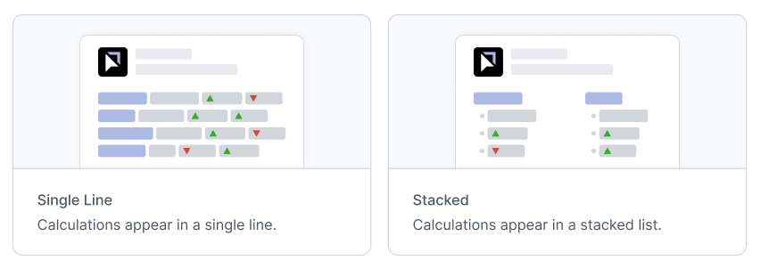
When structuring reports, make sure:
There is a balancing of data values and visuals. While charts offer visual insights, they must complement, not overshadow, the data.
Put the most important information at the top of the report to establish context.
Provide supplemental information in hyperlinks so that it does not distract the reader. These links keep the core report focused while providing more complexity that teams may need to investigate further. Often, teams link to dashboards, charts, or documents that provide more context and analysis.
When adding more data to reports, be critical of all the elements already in the report. Either add the new data into a relevant section or deprecate a section that is no longer needed.
Finally, avoid information overload. Data analysts commonly fall into the trap of adding new requests to the bottom of an existing report. This can make reports less readable and cause confusion. Reports should convey key insights without drowning the reader in a sea of data.
Here’s an example of a basic report that could be sent out in Slack:
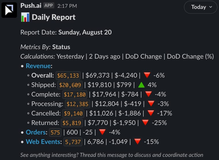
In this example, in the following report, the numbers are the focal point to keep the team focused on the changes day over day. This could be complemented with a link to a dashboard to drill into data points such as why orders were down 4% yesterday.
Now that the metrics and reports have consistent definitions and structure, they can be automated.
Automating Reporting
Step 1 - Choose a data stack
To get started with automation, data teams need to invest in infrastructure to produce the data needed for reports. Teams often rely on a modern data stack for low-cost, easy-to-implement automation. There are many articles on the modern data stack and the categories that provide value. A general modern data stack includes:
ETL (Extract, Transform, and Load): pull data from the sources into a single database
Data Warehouse: efficient storage and computing database designed for analytics
Data Modeling: transform data in the warehouse into useful reporting structures
Semantic Layer: a single definition layer mapping data to business concepts such as metrics and dimensions.
Reporting Layer: tools that provide a data interface from the warehouse to the business teams, often as dashboards, charts, and tables.
Note: Before investing a large amount of time and resources into report automation, ensure that you have picked a high enough value project that will justify the investment in automation.
Step 2 - set a reporting cadence
The value of reports lies in the timeliness of metric updates and insights. For example, if strategic sessions are on the first day of each month, then reports should be ready before the monthly meeting. More frequent reporting cadences such as weekly or daily can be helpful to keep teams informed of changes and take action faster. Aligning the reporting cadence to each report’s use case makes them much more impactful. A good proactive step is to set a reminder to check reporting cadence every 3-6 months so they can be adjusted when needed.
SLAs (Service Level Agreements) are a concept from support teams that establish a minimum time to perform an action. An SLA describes how quickly data will be refreshed for reporting, such as within 3 hours of latency. Having data SLAs allows teams to establish the maximum frequency that reports can be set to.
For the data team, faster refreshing can cost more money due to increased computing and number of jobs that need to be run. The data team should try to balance these costs against the requirements of the business. Business teams usually don’t understand this trade-off of cost versus latency. The data team and business team can align on what level of cost is worth the increased frequency of updates. There will be a point where the business team receives less value from higher frequency and the data team incurs a higher cost that is not worth the tradeoff.
Step 3 - agree on the distribution
It’s important to make sure that stakeholders receive reports in tools they are comfortable with. Most tools have some form of automation available, such as scheduling dashboards to be sent on a regular basis from BI tools like Tableau or Looker or having data connected to Google Sheets. Make sure that reports are sent where stakeholders will see and use them.
Step 4 - run data quality checks
There are a lot of emerging technologies for data observability, such as Metaplane and Monte Carlo, that will test data for large, locate unexpected changes and then send an alert to the data team. You can also run additional custom tests using dbt or similar tools to ensure metric values aren’t changing. These tests allow data analysts to make sure that the data reporting is providing consistent results.
For an advanced implementation of custom data quality tests and governance, you can read the Gitlab Handbook page on data quality.
Step 5 - set alarms and escalation paths
The last step with automated data reporting is to have a clear escalation process whenever a data quality issue happens. Errors and outages will happen at some point and being prepared with a pre-agreed process will allow it to be much less stressful and have less of a negative impact on the business.
Below is a list of steps in a common process. Not all the steps will be required for data quality issues, but most can be helpful, especially in communication.
Clearly communicate the scope of the outage to impacted stakeholders.
Assess the situation and map a course of action.
Communicate updates as fixes are put in place.
Send an update when you have a solution in place and have begun monitoring.
Send an update when the solution has been confirmed and the outage is resolved.
Host an internal data team post-mortem to prevent this type of outage in the future.
The Future of Data Reporting
Automating reporting is not a new concept. It has been around since modern computing allowed people to offload calculations onto machines. However, there has been plenty of innovation in reporting, often subtly such as the ability to connect Bigquery directly to Google Sheets. Teams are continuing to tie the source of truth for data, the data warehouse, to the tools they use to interact with data such as spreadsheets and BI tools.
At Push.ai, we see the future of reporting becoming possible with a focus on creating consistent metric and dimension definitions. We’ve built a way for teams to write metric and dimension definitions directly from their data warehouse so that they can quickly set up any type of reporting they need. Even better, with emerging open-source semantic layers like dbt or Cube and closed-source modeling like Looker’s LookML allowing teams to write definitions in code, the metrics and dimensions can be reused across any data tool. With data definitions centralized, anyone in an organization can find, subscribe and receive the exact data they need, when they need it. We make it easy to send data to the places where teams collaborate. Our users can set up automated reporting and insights to be sent to tools like Slack or Teams. By putting data into a collaborative space through automated reporting, people are able to discuss implications, align and drive action.
Thanks, Britton!
Find and connect with Britton on LinkedIn and Twitter. Check push.ai demo.
Thanks for reading, everyone. Until next Wednesday!