
A Deep Dive into Onboarding Flow Redesign Analysis - Issue 156
A complete redesign of the user onboarding flow. Steps, metrics, and learnings.

Welcome to my Data Analytics Journal, where I write about data science and analytics.
Let's say the product team you support is working to re-design the onboarding flow. You are responsible to monitor, analyze, and report on the new flow performance and potential Top of Funnel lift (that there hopefully will be).
Many analysts think that onboarding analysis is easy.
It used to be easy when it was just on the web. Now with the flexibility of paywall positioning, GDPR screens, and personalized recommendations, onboarding optimizations have become more and more challenging to analyze.
Today I will share an example of a mobile onboarding flow redesign and will walk you through the process, analysis, and caveats of user onboarding.
A well-optimized onboarding flow is a rare art. It is a thin balance between getting all the necessary data about users, using the smallest number of steps, complying with privacy, and maximizing conversions.
Take advice from famed product growth hobbyists with a grain of salt
“It's an old myth that you should oversimplify your onboarding to reach high activation rates. In reality, only super low intent customers that would have never activated in the first place drop off (3 screen/9 question onboarding has no more than 10% drop-off rate).” - Elena Verna.
No, it's not. Data from a lot of case studies points otherwise (here is one - The 8 best user onboarding examples from analyzing 150+ companies, but there is so much data on this out there). Even if we ignore the data, how about having the opportunity to re-engage these “super low intent customers” or Adjacent users?
What is a good onboarding rate?
Onboarding analysis will be different for B2C vs B2B or SaaS. So the benchmarks are, as well.
A successful onboarding flow would capture enough data from users which could later be used for personalization and recommendation algorithms. At the same time, its completion rate ideally stays above 60% in B2B and SaaS and above 50% in B2C.
I’ve noticed investors and growth advisers loop too many things into onboarding, like product activation (which you can’t measure until you have a user in-house) or paying within the first 6 months(and where did “6 months” come from? I have too many questions about the recent Kyle Poyar free-to-paid piece).
The onboarding definition I will be using today is related to the steps users take to initially set up their account BEFORE they activate the product or make any purchase.
Onboarding flow analysis
🍿Getting started
Re-designing user flows is naturally complex because it involves changing user behavior by adding new screens, changing the copy, re-positioning CTAs, and much more. In my experience with heavy redesign procedures, here are some tactics that I recommend:
Run a set of smaller A/B tests with one change at a time, rather than one big test with many changes and many variants. You know why.
Start with finalizing the user step sequence first before any copy changes. This is the most challenging step because you don't have a baseline for the new flow. This step includes testing (a) removing screens, (b) adding screens, and (c) changing the order of the screens. Be prepared, as this is the most time-consuming part. You might have many iterations with many multivariable tests.
After the user step sequence is optimized, proceed with CTAs testing. And only then should you change the screen layout. In my experience, re-positioning CTA buttons returns a higher impact than changing the screen layout.
When CTAs are set, continue with the rest of the copy changes, testing (in this order) banners, wording, layout, and then colors.
Once the final optimization is successful, localize (if relevant). Be prepared to repeat the same for different locations depending on your product/service.
How to decide which screen to start testing with?
Get onboarding funnel conversion data for every step. Then sort the onboarding screens by each step's conversion rate. Put the highest conversion steps upfront, and the lowest converting steps at the end. Remove steps with the lowest conversions or move them to the very end.
🫕 Pre-launch:
New screens require new analytics.
The first step is to work with the product manager and create a catalog of the current onboarding flow. You have to agree on a name for every onboarding step, describe its objective, and document analytics for it.
Once it's done, then your team can begin setting tracking for screen views. My recommendation is not to overwhelm analytics with events and to set up only the main event for every screen, e.g. screen_view.
In some cases, it's also helpful to create:
cta_click (IF there is upsell, survey, or else important. I'd ignore clicks to "next” screens)
secondary_button_click (if relevant) or skip_screen event for the optional screens
But frankly, in 99% of cases of modern onboarding flow, I'd ignore these two.
🚀 Launching tests
Hypothesis: you will have different hypotheses for every test. For example, you may start with "Removing the email confirmation step will increase the number of successfully completed signups". Or "Moving location_screen before preferences_screen will increase the number of users landing on preferences_screen" and so on.
MDE: for the user flow testing, all your MDEs are likely to stay small. Your Top of Funnel traffic, I assume, gives you a large sample size. So even a small lift in conversions will be impactful. (It’s a reason why I like onboarding tests. You might change one little thing and its lift will echo in every downstream metric).
Test timeline: it’s a good thing Top of Funnel tests usually run fast. Be prepared to run multiple tests in a sequence. I remember it took us over 4 months to finish more than 15 tests.
A/A: given you introduce new events, and will be testing new user flow without historical data to compare it against, it's recommended to set between 2 to 4 days for the A/A test to make sure the experimental platform works as expected and users are randomized correctly. Once it's done, you also can use this data to confirm the timeline for the test to reach significance. Win-win.
My recommendation is usually to launch treatment to 5% traffic for a few days to monitor the initial data. Especially for the first round of user step sequence iterations.
If you have confidence that the test is unlikely to make a negative impact (removing the Email confirmation screen, moving the How did you hear about us screen to the end, eliminating other screens that requested more user data), you can skip the slow rollout and launch a test to the larger traffic. I still suggest going slow with the new screens to make sure you won't lose many users if things go wrong.
💔 Too many screens, too many steps
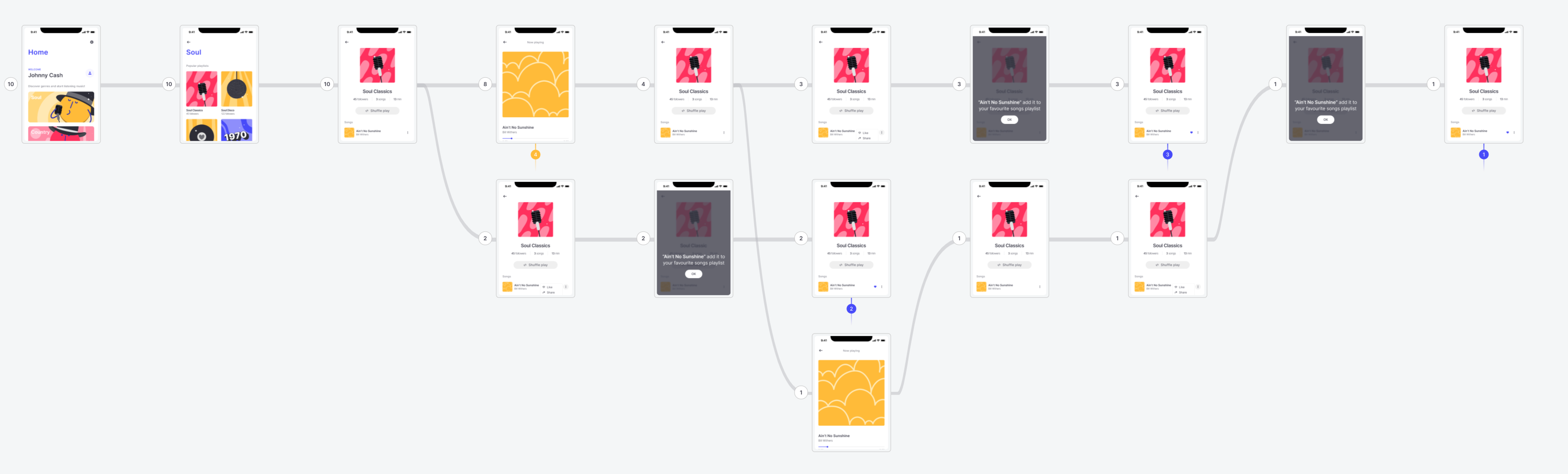
The most impactful onboarding redesign project that I remember ran for over 4 months. Our initial S-T (Signup to Trial) was 0.08%, and after further analysis, we learned that only 25% of users successfully made it through the onboarding flow. So we were losing 75% users in the flow which we paid to acquire. Harsh.
The initial onboarding funnel included 9 screens, starting with a common Welcome screen and ending with the Upsell. It also included an email verification step. Every further screen was capturing some type of user data - demographics, location, and preferences. Mind you, we didn't even have to worry about the GDPR screen at that point. And yet, after confirming that only 25% of users made it through the flow, it was clear that we had to re-design and optimize it.
📊 Our analysis and learnings:
Every test was performed differently, as expected for the onboarding revamp. We had clear winners and some losers, and we also had a few inconclusive tests which we launched again with another flow or copy iteration. As a result of multiple multivariate tests, we optimized the onboarding flow by 220%! After the redesign, 80% of users successfully completed all onboarding steps (compared to 25% with the old flow).
💡 What we learned:
The biggest step to cut off users was an email verification wall. Once we removed it, we jumped up to 50% more successful signups.
The marketing survey (how did you hear about us) didn’t seem like a big deal but was costing us 30% of users. We removed it from the onboarding flow (another marketing initiative was launched later to gather this data for already registered users).
The location screen that was requesting the user address was removed from the flow, along with a demographics step. We made these optional screens and encouraged users to fill them out on their 2nd visit. It increased completed signups by 60%.
Another win was to remove the product tour video from the onboarding steps and offer it after the registration was completed. It gave us another 40% boost.
Most of the newly tested copies with round buttons and dark screens boosted conversions by at least 15%.
We ended by putting the highest-performing screens at the beginning of the funnel. The lowest-performing screens were removed. If we had to keep some, then we put them at the very end of the flow. Shifting scenes around improved the funnel completion by almost 50%.
Changing the positioning of the upsell screen was the most impactful for monetization. To my surprise, the highest trial conversion was received after testing the upsell screen as THE FIRST screen users see in the onboarding flow - before the welcome screen. As I also learned recently (and which confirms my findings) is that apparently, users are the most likely to convert in the early steps. Right after the Install event. The further down upsell is pushed, the lower conversions it returns. I find that fascinating.
A general rule for me is a 40% improvement in onboarding conversion returns up to 4% S-T (Signup to Trial) and 3% I-T (Install to Trial) improvement. Optimized onboarding flow can return up to a 1% to 2% increase in DAU and Retention Day 1. It is unlikely to impact MAU, Retention Day 7, or Day 30.
Testing the same onboarding changes on different platforms may show completely different results.
Overall, it takes about 4-6 months to fully re-design the flow (depending on the current stack and analytics).
Summarise:
Reiterating onboarding flows is one of the most impactful product initiatives to move Top of Funnel conversions.
Onboarding flows can be difficult to measure. Most modern flows are not funnels but trees, or worse - reverse trees. Depending on the user's answer, the flow might reverse and change the sequence of the steps. For analytics, it implies you might need to replicate over 10 different multi-step funnels and build reporting for every variation of user flow. It can be a lot.
As a compromise, I have seen many teams agree to report only high-level funnel, e.g. welcome_sreen to signup_completed. The downside of this approach, when you test multiple iterations of the flow, you won't be able to use this high-level Baseline as a success metric. And in many cases, analytics for the interim screens are missing.
Keep event analytics light. Don't create a new event for "next", "back", "learn more" or other CTAs. Stick to the screen name events only. You should be able to build funnels just by using high-level screen analytics.
Use slow rollouts and A/A tests, especially if you add new screens.
Onboarding analytics quickly becomes messy unless you organize and maintain it. Start with the event catalog to record screens and user step(s). Update it with every flow iteration. It does take a lot of work. If ignored, your analytics team won't be able to report on which onboarding steps underperform.
Start with finalizing the user sequence first. Then CTAs. Then Copy changes. if something does not work out, it's easier to reiterate and change the Copy rather than the steps sequence flow.
Put the highest conversion steps up front. Remove the lowest converting steps or keep them at the end.
It's proven that the shorter your onboarding flow, the better it performs. I see more apps go for not having onboarding at all, and put the upsell screen as the first screen users see after the welcome screen, or activation CTA as the first initial step. Users have the highest motive when they install your app. Don't waste it on onboarding.
Thanks for reading, everyone. Until next Wednesday!
Super insightful. Thanks Olga for writing in this great article and sharing your knowledge based on your rich experience.