

This Month's Recap: User Engagement, Time Series, Growth Analysis, And More - Issue 37
This Month's Recap: User Engagement, Time Series, Growth Analysis, And More - Issue 37
A recap of data analysis publications, news, and tutorials over the past month.

Good morning analysts, and welcome to a free-edition of the Data Analysis Journal newsletter, where I write about data analysis, data science, and business intelligence.
It’s the last week of March 🌸. And yes, we are all busy putting together success stories to close our Q1, evaluating KPIs, preparing decks for investors (or whoever you own the universe), checking if our revenue forecast for Q1 2021 that we built last year turned out to be true (it hopefully is!), and wondering if that A/B test on a new landing page will be over before the Holi festival.
Because of this flurry of different activities, it’s a busy time for analysts. Today I am back with a quick recap of news, events, publications related to data analysis.
If you’re not a paid subscriber, here’s what you missed this month:
🔥 What’s new this month
March marks a year of pandemic.
This is a good time to reflect on how a global pandemic affected growth at different companies. Amplitude did half of the work for us, sharing their Covid 19 digital report that highlighted industries that skyrocketed during last year (a spoiler alert - it’s streaming media and e-commerce).
My favorite research & analytical platform APM Research Lab shared recently 2 in-depth studies:
America's renter eviction crisis, by the numbers, noting that 1 in 5 American adult renters are behind on rent. “Louisiana and South Carolina have the highest proportion of households not caught up on last month’s rent, each at slightly over 35%. Those states were closely followed by Delaware, New York and Mississippi.” People with children are twice more likely to be behind on rent compared to those without children.
Color of Coronavirus: Covid 19 deaths by race and ethnicity in the US analysis indicates that Indigenous, Black and Pacific Islander Americans have experienced the highest death tolls.
If you want to do more data analysis yourself on publicly available Covid 19 data, check out the COVID-19 Data Hub, developed and supported by Tableau. You can either browse through expert-developed dashboards and charts or run your own analysis. (That’s the best product promotion I have ever seen. Good job, Tableau!)
In other interesting news, Atlassian acquires Chartio. As a result, Chartio is going away next year and saying goodbye to all its customers. If you aren’t aware, Chartio is (was) a famous cloud-based BI tool that allows you to create charts and dashboards via multiple data sources. Just like Tableau or Sisense/Periscope, but with better visuals, formatting support, and price. I worked with Chartio dashboards for a while and enjoyed their features and visualizations. Sad to see them go.
⏪ A Rewind Of Last Month
Paid Subscription Articles You May Have Missed
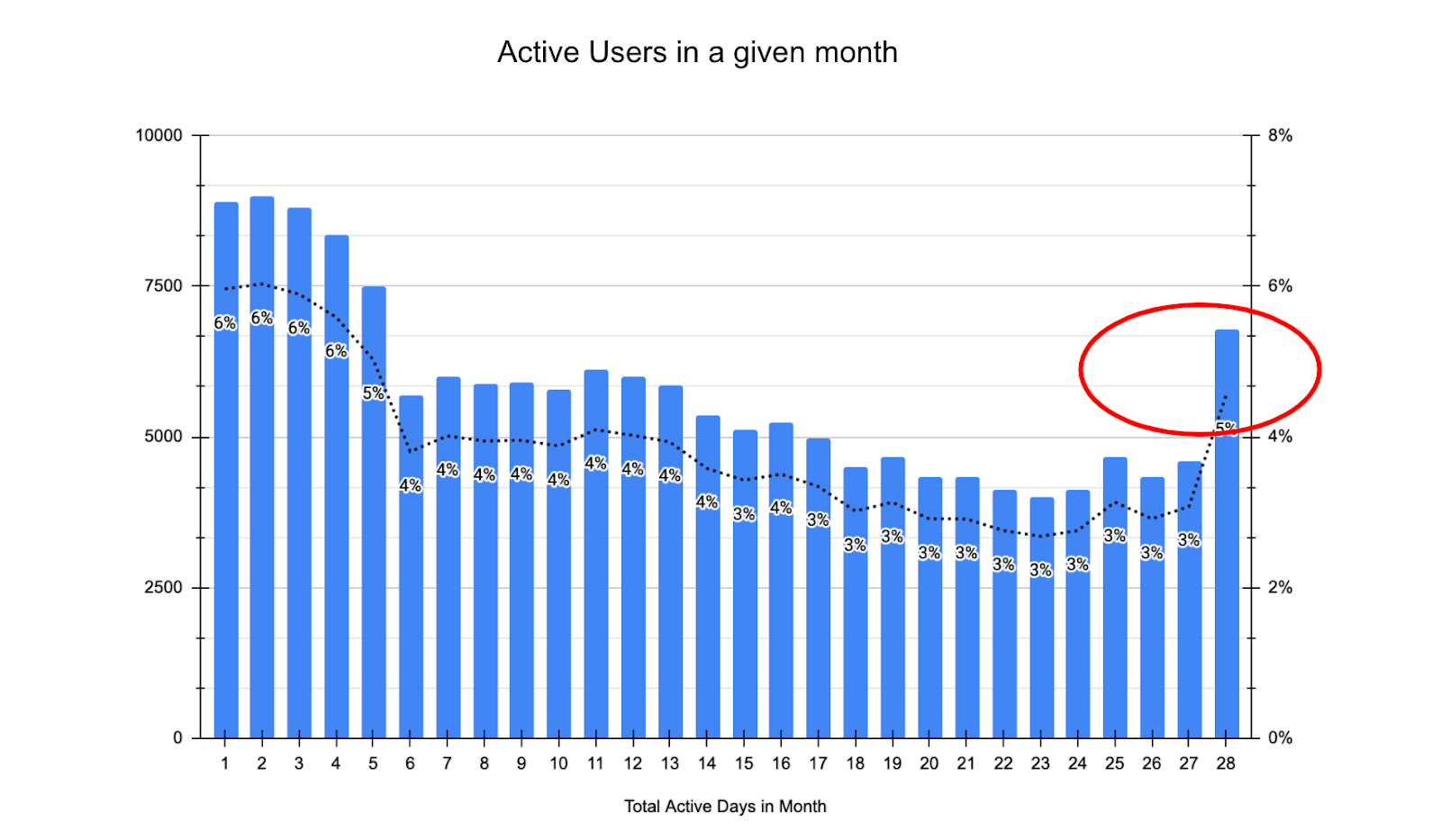
User Engagement and Activity Histogram Analysis
User engagement is one of the best indicators that people love the product they use. You can improve user engagement if you can define and scale it. User engagement can mean any interaction with your product or it could also be a list of specific actions (or that one action). One of the ways to analyze it is Activity Histogram - the frequency of engagement. In this article, I demonstrate a walkthrough of how to approach and conduct Activity Histogram analysis using SQL.
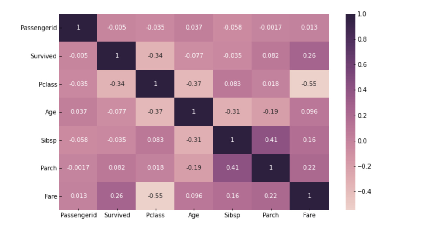
Correlation Analysis 101 in Python
Does correlation imply causation? Or how do you prove if features X and Y are correlated?
After this helpful guide, you will know the best way to answer those types of questions. In this article, I focus on positive and negative correlation analysis and specifically cover:
Practical use cases for correlation analysis.
A methodology for how to build a correlation table and a heatmap in Python Pandas.
How to read and interpret different heatmaps and correlation charts.
How to prove that correlation implies causation.

Essential Tools For Data Analysis
This is a list of my favorite tools and applications for data analysis that I use and rely on a lot in my work for data acquisition, data processing and transformation, data analysis, and data visualization.
Note: I don’t do sponsored promotions. Every tool or application that I recommend is one that I personally use for data analysis and stand by.

🏆 Nailed It
Be prepared for your next interview on calculating growth data
What technique would you use for analyzing seasonality, trends, cycles, and irregular fluctuations? Time Series. I know many people are struggling with understanding time-series analysis. To extend a helping hand, I wanted to share this helpful video that breaks down the foundation, implementation, and different use cases for time series analysis in Python, along with building plots and reading data. The code from the video is also here.
Year-Over-Year growth is the most common analysis for long-time-scaled data. This is usually the first analysis you run joining a new company, and it’s also one of the common assignments for product analytics positions. This article from Sisense about how to calculate YoY growth is a good intro to definitions, when and why you need to run YoY analysis, and the main technique to use. There is much more to it than the article covers, though. More techniques, more cases to watch for, or exceptions to keep in mind. In one of my next publications, I’ll do a deep dive into analyzing growth metrics and running YoY calculation.
🧭 Expert Spotlight with Duong Vu
An insightful look into what it takes to become a data scientist and what to look for when interviewing or growing your team
One of my favorite stories to read is about people transitioning into tech from other industries. It takes more work, it’s challenging, and it’s so inspiring when they succeed and become leaders - and leaders with whom you want to work with and learn from.
This month’s interview is with a data scientist Duong Vu, who is also a mentor, Vancouver Women in Data Science Ambassador, and Women in ML&DS co-organizer. She is the author of DataCamp tutorials such as Generating WordClouds in Python or Introduction to Geospatial Data in Python.

Her path to becoming a data scientist was not a common one, and yet her experience and knowledge inspire many people (including myself) to develop and pursue a difficult and exciting world of data.
One thing I keep reminding myself is that you should not compare yourself to other people. Everyone has a different starting point. The background gives a different perspective. You might see a problem from a different angle. People have to try out different things and see what they are good at.
Read the full interview with Duong - Expert Insight: Duong Vu - Best Ways to Learn Data Science
🎧 Podcast
New interesting podcasts on data analysis.
This month I would like to feature Karen Jean-Francois’s podcast - Women In Data. Every other week she picks an expert across different industries to discuss applications, different roles of data professionals, challenges in their career, and tips on how to succeed.
Some of my favorite picks:
Elisabeth Yaneske - Using data science to understand human cells mechanisms
Kanwal Bhatia - Images are numbers! From medical imaging to sports analytics.
⚙️ Try It Out
It just might solve all of your problems
That gnawing, awful feeling when during a coding interview you are asked to solve a SQL challenge using a tool that runs only on basic old MySQL 5 (or so) dialect that doesn’t support window functions, CTEs. Worry no more! A few days ago I run into a JOOQ SQL translator that reads and formats (!) your SQL input and re-writes it into any SQL dialect (MySQL, PostgreSQL, SQLite, Vertica, SQLserver, MariaDB, Oracle, and others). That means that now you can take any un-readable code from your coworkers and reformat it nicely within seconds. You can also translate the same queries in no time across multiple databases. Boom. Piece of cake.
Thanks for reading, everyone! Until next time!