Don’t make these 5 mistakes - Issue 41
A recap of data analysis publications, guides, and news over the past month.
One day when I’m very old and crusty, and my grandchildren come to me to ask for a word of wisdom, I will look them dead in the eye and with a painful memory whisper: never... never use a dual x-axis for a column chart.
Welcome to a free edition of the Data Analysis Journal! A newsletter about data analysis, data science, and business intelligence. If you’re not a paid subscriber, here’s what you missed this month:
❤️ Giving back
This year I’m partnering with an ODSC Europe Virtual Conference 2021, and have 2 free tickets to give away to my readers. This is the largest applied Data Science conference happening on June 8-10th with multiple sessions and workshops on ML and Deep Learning, Big Data Analytics, AI, Data Engineering and MLOps, and more. Let me know by the end of this week if you are interested in attending, and I’ll send you the tickets!
Also, you can purchase 10% discounted tickets for your team following this link.
🏆 Nailed It
Transforming raw data points into a story that drives growth and revenue takes patience, attention, and increased blood pressure. Re-using the same frameworks, SQL, or steps for analysis often opens the door for making mistakes and inaccuracies. New tools, approaches, or pressure often introduce inconsistencies, preventing even experienced analysts from noticing obvious errors. Below is a list of mistakes and bad practices that are common for analysts across all levels. Keep an eye on these when delivering your insights.
1. Weighted sorting
This one is more common for novice analysts. First, there is no rule or requirement anywhere telling you to present your data only with a sorted logic (unless you report top 10 referrers/visitors/customers. Then it is a must). But it’s a good practice to do so to help your readers follow the story. And the best practice is to sort not by weight, but by impact:
2. Reporting non-significant data in %
This looks like a significant MoM change for upsell clicks:
But the % is not meaningful there. The true picture is below:
First, if you can - do not report it at all. If you have to, present in absolute numbers or both - raw number and percentage or rate to give a full picture of impact. Otherwise, you will mislead your readers.
3. Complex Dashboards
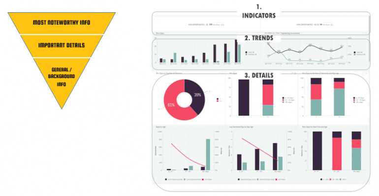
This is the case for less is more. There is so much guidance out there on how to design a good dashboard. The rule of thumb is to have not more than 10 charts per dashboard and follow the inverted pyramid method: (1) start with the top 2-3 top-level metrics, (2) add their most important trends, and (3) finish with other details:
Read Sisense guide on Dashboard Design
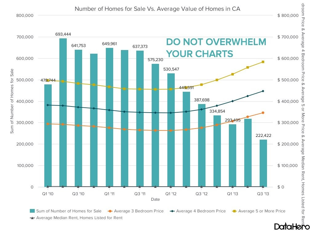
4. Overloaded charts
Similar as above, the best practice is to follow simplicity. Watch out for labels. While you might think that they add insight or complete the picture, in fact, any additional information distracts and slows down chart reading. Keep only vital information on your visuals. The best chart gives the audience a clue of the story without legends or description. It’s a skill to master, but at least not making your visuals look like a Disney Christmas Tree is a safer way to go.
Read this guide on How To Choose The Right Chart For Analysis.
5. Dropping empty values
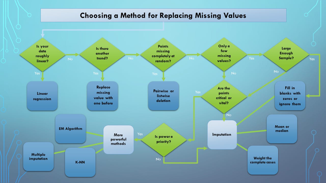
Every data analyst at some point has to deal with missing values in a dataset. A few months ago I published an issue about it. There are cases when you can not drop or ignore NULLs and proceed with analysis or modeling. There are cases when you have to compute missing values. Missing or ignoring this step may lead you to the wrong result that may cause a negative impact. Read here to learn when and how you should decompute nulls with average values or follow this guide:
Taken from here.
🧭 Expert Spotlight: Ziv Wangenheim - How Data Analysts Can Evolve and Adapt
An insightful look into some of the biggest challenges for data analysts, and how to overcome them while building a data-driven culture
Building a data-driven culture is not easy. Creating an environment where analysts can flourish and develop depends on so many factors - leadership, budget, data strategy, data maturity, and so on. Investing into data culture magnifies analysis impact. We know it, we talk about it, but how do we make it happen?
There is no better expert to ask than Ziv Wangenheim, co-founder and CEO at Rupert whose mission is to improve and automate data process and discovery so that analysts can focus on real data analysis - getting insights and building partnerships with their stakeholders and teams. I had a chance to interview Ziv, and I’m very excited to share some excellent ways to help analysts not only thrive but actually enjoy and love their work. Read the interview.
📈 Your Next Data Science Project
If you are getting started with Kafka, Hadoop, Hive, or ML applications, check out the new Training platform for data science called ProjectPro. They provide a library of verified, end-to-end project solutions in ML and Big Data that you can reuse or replicate. They offer paid subscriptions, but you also can get started by going through their Free Recipes to get a peek into Python, R, or ML solutions.
📚 Shameless promotion
I am proud to be one of the authors in the book Analytics Interpreted: A Compilation of Perspectives - a curation of leadership, perspectives, and frameworks across the most relevant topics in analytics, such as data ethics, analysis, strategy, modeling, and more. It is now available in paperback from Amazon for fancy old-fashioned readers.
*Proceeds of the book go towards the Data Science Summer Camp and analytics programs curated by the Women In Analytics community to provide free resources to young women.
Thanks for reading everyone. Until next Wednesday!


