
How to use product data to drive user engagement and retention - Issue 222
Amplitude dashboard template for tracking core engagement metrics and feature usage for mobile apps

Welcome to the Data Analysis Journal, a weekly newsletter about data science and analytics.
Understanding the frequency and volume of product usage is the most important step in unlocking insights into user engagement and behavioral analytics. We talk about DAU and retention all the time (I’ve probably written over 100 articles on engagement analytics alone), yet working with event data still requires time and effort to make sense of events and find the right way to structure them.
Last week, I introduced a new template for a Mobile Subscription App Engagement and Retention Dashboard for Amplitude users. The dashboard tracks metrics such as DAU, the DAU/MAU ratio, average usage per user, app usage frequency, month-over-month views, and more, offering a comprehensive view of user engagement and lifecycle.
In this publication, I’ll walk you through my template and top engagement metrics, showing how to identify daily or weekly app usage cycles and how to report top actions and retention.
If you use Amplitude, you probably saw last week’s announcement - Amplitude Made Easy - where they introduced “effortless” (sure, we’ll see) analytics via expert-created templates. I am honored to join renowned PLG experts like Kyle Poyar, Elena Verna, Dan Schmidt, Drew Teller, and, of course, timo dechau 🕹🛠 :

You can browse through their Template Gallery, pick a template, customize it, and make it your own. I’ve reviewed most of them, and each one offers something unique. They’re all helpful, but obviously, mine is the best 😈! After all, nothing is more exciting than uncovering product usage patterns. When you understand which features and user milestones drive engagement and retention in your app, everything else falls into place like a puzzle.
Top 5 Engagement KPIs
I like to open each of my dashboards with a bold display of the top 3-5 KPIs that clearly represent the engagement ecosystem:
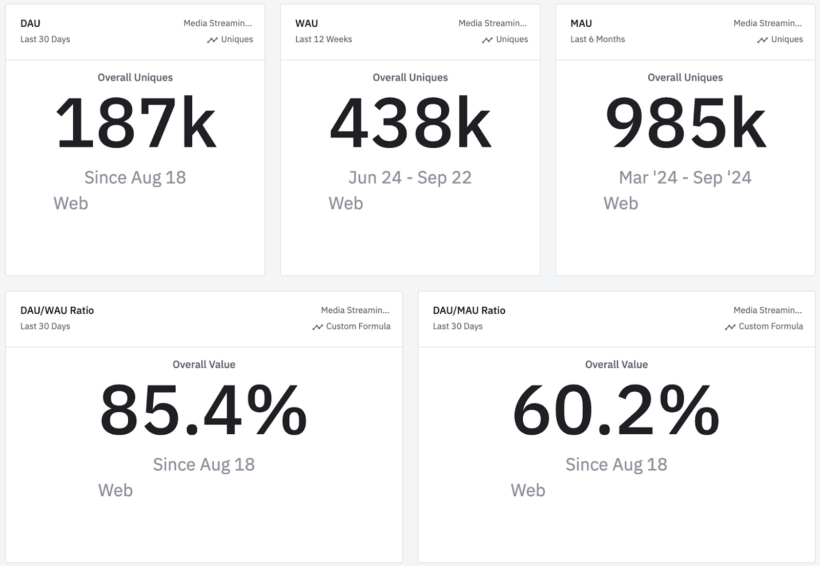
Right there, we see the most important engagement milestones (DAU, WAU, and MAU) and their distribution:
85% of users engage with the app every day of the week.
60% of users engage with the app every day of the month.
This view of the top 5 metrics is designed for executive teams, who (hopefully) have the dashboard bookmarked. They can quickly open it during calls to check a baseline or a benchmark.
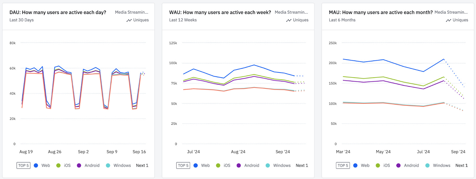
For my team and myself, I prefer a timeline view of each metric segmented by platform or top regions, like this:
📌 Depending on how you define an "Active User" (whether you include new users or not), you should set user filters as New or Active.
📌 For mobile apps, no matter how precise you are in defining Active Users and filtering out new users from DAU, some % of DAU will still be categorized as New Users (due to re-installations, different sign-up emails, or use of different devices, etc.).
Reading charts above:
The first DAU chart highlights natural user cyclicality, with activity dipping on weekends. This can help guide the timing of user outreach, such as notifications, emails, or feature announcements.
The second WAU chart is useful for (indirectly but accurately) monitoring the success of ads and marketing campaigns.
The third MAU chart illustrates seasonality and external factors influencing user behavior. You can take it a step further by segmenting MAU into cohorts such as new, core, or resurrected MAU to gain deeper insights.
More usage doesn’t mean better usage.
When analyzing engagement data, it's crucial to monitor activity spikes. An increase in DAU doesn't always translate to better feature usage or improved retention. Here are three common types of spikes:
Top-of-Funnel Spikes: These occur when a campaign goes viral or ads are boosted, leading to a surge in new installs. This causes sharp increases in DAU, WAU, and engagement metrics across the board (driven by new users). However, this spike often declines over time, bringing your net new DAUs back to close to zero.
Notification Spikes: Teams often experiment with notification frequency to re-engage inactive users. After sending notifications, you might notice a temporary DAU increase. However, this boost, unfortunately, often doesn’t translate to long-term MAU growth. If this is the case, follow the user journey to identify when and why users lose interest.
Start Session spikes: When a new feature, screen, or menu is added, Start Session events may rise, resulting in an overall DAU increase. However, this spike can sometimes be due to improved session tracking (or, worse, background activity being captured), creating a misleading view of increased engagement. (I covered it more here - Do You Over-Report DAU?)
This is why, alongside top engagement metrics, it’s also important to track the frequency of usage and averages:
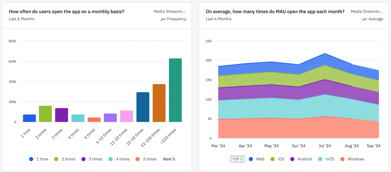
Frequency of usage: The chart on the left is one of my favorite views. It shows how frequently users open your app on a given day, week, or month (this example uses a monthly view).
This is not real data. It shows an unusual usage pattern: many users engage with the app over 100 times per month - something rare. Typically, most users fall into the 1-3 usage bucket.
As your app matures, it’s exciting to see how these user groups shift to higher usage buckets. That’s how you know users love your product - they use it more than 5 times per week or more than 20 times per month.
Average activity per user: The chart on the right displays the average activity per user, segmented by platform. Usage patterns tend to vary significantly between web and mobile. I’ve set it to an overtime view to see a histogram. However, this metric rarely fluctuates unless a new big feature is introduced.
❗Remember: Whenever you see an "average" metric, watch out for outliers.
❗Also, if you have a large number of test users, bots, or admins impersonating a group of users, this will be reflected in averages, and hopefully, you have a way to filter these out.
Average activity per user is not sensitive, so if it starts to decline, it’s a major red flag. Such a drop will likely signal an upcoming retention decline. You probably missed early warning signs such as decline in onboarding flow, activation, paywall views, or screen views. If you are dealing with average activity per user decline, you should segment DAU into cohorts (New DAU, Core, Power, Resurrected) to pinpoint which user persona is underperforming and at which product milestone.
Monitoring product feature usage
I often refer to product milestones, which include the onboarding flow, activation, and repeated core app usage. For tracking core feature activity, I use these charts:
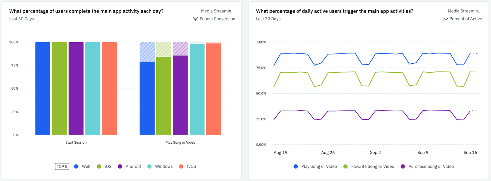
In my template, I don’t explicitly label anything as “activation” and instead refer to it as “main app activity.” This is because pinpointing activation requires a certain level of analytics maturity and a significant amount of data, which newer apps might not yet have. Instead, I recommend using 2 key metrics:
The top actions you expect users to perform in the app.
The volume of users who complete these top actions.
For a deeper dive into product feature analytics, read The Ultimate Guide to Product Features Analysis.
I designed my dashboard template to be adaptable for most mobile apps and, hopefully, easy for everyone to read and understand - whether technical or not. I don’t believe there’s a template out there that you can plug in and be done with. You’ll still need to add filters, adjust segmentation, set date ranges, and apply other customizations for any template to fit your needs. So, I wouldn’t call it “effortless.”
That said, having access to a gallery of pre-built visualizations and formats, all vetted by domain experts, is a game changer. You can leverage their metrics and definitions to understand which questions to ask and how to find the answers. It’s incredible to see how far product analytics have come! 🚀📊
Thank you for reading, until next Wednesday!
Hi Olga,
Thanks for you article. I have a small question. Sorry if I'm missing something.
> 85% of users engage with the app every day of the week.
Are you sure that the DAU/WAU metric has such a meaning? Consider a hypothetical corner case. Suppose that users don't engage at all and leave a product as soon as they try it. Suppose also that the number of the new users arriving each day is constant -- 100. Thus, each day WAU = 700, DAU = 100, DAU/WAU = 1/7. But this doesn't nearly mean that 14% of the WAU users the app every day of the week. The number of users who use the app daily is 0.