When Things Go South - Issue 70
A never ending battle with data quality, unexpected drawbacks of data automation, and failed A/B testing.
Welcome to a free edition of the Data Analysis Journal, a newsletter about data analysis, data science, and business intelligence.
If you’re not a paid subscriber, here’s what you missed this month:
The Future Of Data Analytics - every few years, a new analytics role emerges within a market that requires a slightly different skillset. How does one adapt and stay competitive? In this publication, I focus on some patterns happening today in data analysis and share my musings on where all this is going.
Analytical Case Study On User Engagement - let’s say you are a data analyst at Twitter, and your team noticed the average number of tweets has dropped 20% in 2021. What analysis would you do?
How To Pick The Right Metric - what metrics are helpful for measuring and quantifying the impact of a product rollout or a new feature? Difference between sum and counts, distributions, probability rates, and ratios.
As you know, I am on a mission to inspire people to learn data analysis. Many of my newsletters cheer on how exciting and fascinating the analyst job is. Analytics is a cross-functional role, so analysts know all the rumors, the company’s business strategy, direction, the current and expected revenue, the state of tech debt, and the quality of code.
We are best friends with the Marketing, Finance, HR, and Product teams, accepting daily prayers and bribes. And we sell our soul to the Data and Platform engineering teams because any change they purposely or accidentally do can get us either fired or promoted.
Jokes aside, as fascinating and interesting analytics is, it often becomes stressful and challenging. Today I will share some examples from my past showing how difficult, unpredictable, and sometimes unfair an analyst job can be. I can’t mention companies, names, or real data stats. My intention is simply to show that every success story we put out there to celebrate was not an easy win and often involved long nights of work, gray hair, and panic attacks.
Bad data = bad analyst
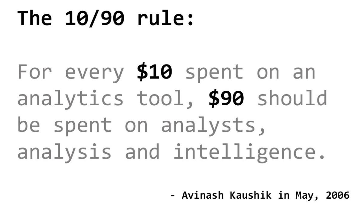
Data is a mess at almost every company, and it’s getting worse. 90% of data teamwork is focused on making data “less bad”. It’s never good or perfect. It’s workable to a degree. Basically, today’s analyst job is to put a system of checks in place to get a higher degree of trust in it (which was not the case 7 - 10 years ago).
Working daily side by side with data engineering and data science teams, analysts can frame requirements, support Q&A, validation, provide thresholds for alerts, follow the same data governance, re-use EDA and clean sources. Even if the data is a mess, at least all the built forecasts and models will fit the same dashboards and metrics, because all come from the same source with the same governance. If analytics is part of the business function and separated from data engineering, you will spend twice as much work on validations, and it often becomes a never-ending quest chasing numbers between different data layers, lakes, and marts, and putting puzzles together that just do not fit.
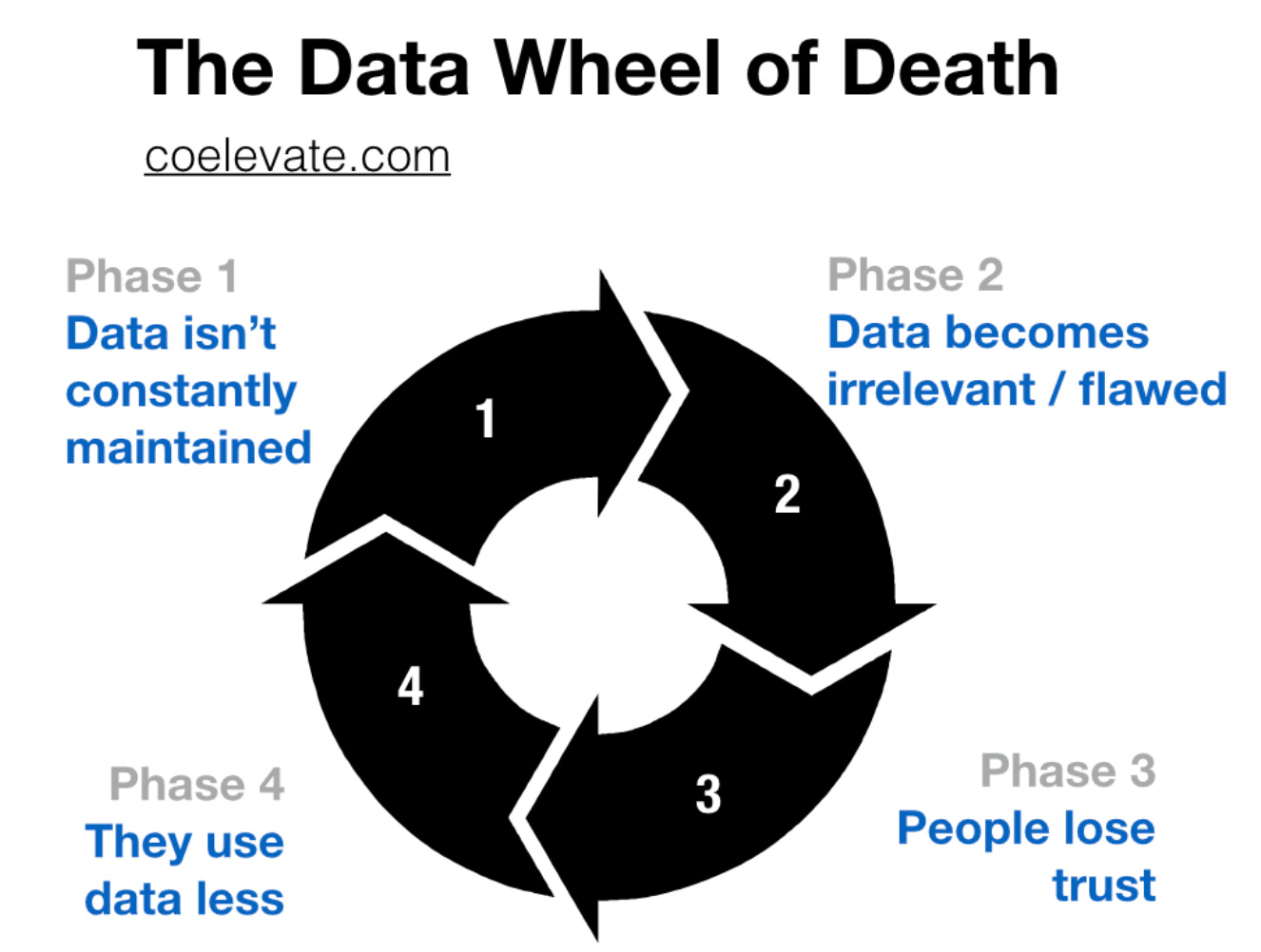
From Brian Balfour: How You Battle the "Data Wheel of Death" in Growth
Sometimes you still can make it work. For example, if your data seems way off, but you have to report user growth YoY, you can compare the proportion of growth rate between different sources to get a range. If your range is matching between 2 sources, that’s a green light for you even if the number of users every month seems way off.
But if the numbers do not match, or worse, they grow in the wrong direction, there’s not much you can do. You are at the mercy of a bad data ecosystem and management, and most of your analytical efforts will likely fail. If you think you’re ever in that situation, the way out is via (1) an active collaboration with engineering teams on improved tracking, (2) working with a product team on setting the data mindset, (3) proactively contributing to data governance (if not owning it). Some of these steps are described really well in this Reforge article - Why most analytics efforts fail.
Good Answers, Bad Questions
Too often I hear something from data leadership like: “We want to empower every team with their own data exploration”. The intent is good - provide tools to everyone to answer their data needs and reduce the volume of data requests for analysts. But here is where I have a problem with it.
Most data requests involve analysts reframing the question that leads to either “we can’t answer it with the data we have” or “instead of A, we can provide you B”. Now imagine the let-me-help-you-to-ask-the-right-question layer is gone. What happens?
I remember being “lucky” to get on a team that spent 4 months developing an internal querying tool that allowed business teams without SQL knowledge to get data they needed either for marketing initiates, public media profiling, OKRs estimations, and other things. The intent was to free up analysts from daily and often repeatable adhocs. Then we spent another month on teams training and another few weeks on documentation and dictionaries. The outcome was that the volume of data requests actually increased. Additionally, to help teams understand why the data they got was not the answer to their question, we had to manage access, onboarding, support, and tool maintenance. The cherry on top was when our executive reported wrong numbers in the media. The data he got was correct, but it was not the right answer to his question. As expected, the whole data team took the blame and a hit.
I would rather have great people using poor technology than great systems and a team of people who don’t know how to use data.
- said Ken Rudin (Head of User Growth & Analytics at Google, former Head of Analytics at Facebook). And I couldn’t agree more.
WTH is wrong with this A/B test?
There is an expectation out there that there isn’t t much analytical work involved in testing besides estimating significance, timeline, and analysis of results. Test-obsessed leadership often doesn’t understand why it takes a fair amount of time and effort to not only read but actually launch the test. But here is a thing with A/B tests - no matter how simple or quick it expects to run, you never should mess with statistics.
I covered some common pitfalls of A/B tests in my A Guide To A/B Test Evaluation. Today I wanted to share one A/B test example that still gives me nightmares.
Almost 2 years ago the product team which I was supporting shipped a new experience for players in the gaming app. It allowed users to “poke” other players in a game. We wanted to test if this improved poking feature (Variant) increases user engagement (players would start more games, send more messages, play more often, etc.) It sounded straightforward. What could possibly go wrong?
When we launched the test, we noticed that engagement increased for both groups (Control and Variant) even though the feature was available only for Variant users. How could this be? How come users who did not have the “poke” ability would also play more? Upon further investigation, we confirmed that Control users started more games after being “poked” by users who were in the experiment. And this is a classic case of the network effect (when one user’s change in behavior impacts another user’s behavior). It means that the test result is diluted, and we can’t trust it.
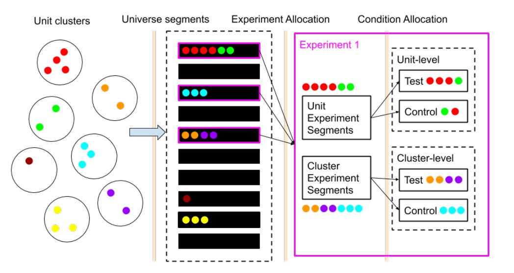
When dealing with network effects, the right way to perform the AB test is via (1) cluster sampling and (2) running multiple tests: one for individual user-level and another one for the cluster-level, and then comparing results. Sounds straightforward. What could possibly go wrong?!
Creating clusters was difficult because we didn’t have isolated users or player communities, as there was a lot of overlap in connections, messages, and games between players. And the clusters should have as little interaction between them as possible.
At first, we created too few clusters that were impossible to randomize.
Then with another logic, we ended up having too many clusters, and isolation got broken (meaning there were too many connections between our cluster groups).
We also struggled to get clusters of similar size and proportion for the test to work.
With going back and forth on it for a while, and then spending another few weeks on figuring out the right cluster randomization algorithm, we were able to find a balance between the number and the quality of the cluster. Exciting.
From Network experimentation at scale
Our randomization passed all the checks and the A/A test looked good, so we launched for the larger sample only to see the same results for our cluster layers as for individuals. Engagement still was up in Control after elimination of the network effect. We ignored the test results and still shipped the feature to everyone. There was no noticeable change in success metrics afterward.
So we had to abandon the test, but… What happened there? How? Was randomization off? Perhaps a skewed cluster volume? Type? Wrong rollout procedure? It still keeps me up at night. I’m currently accepting prayers for any residual stress. And also Paypal.
Related publications:
Thanks for reading, everyone. Until next Wednesday!


