
KPIs Done Wrong: Fixing Common Reporting Mistakes - Issue 228
How to avoid the common pitfalls of over-complicating KPIs, using ineffective proxies, and misapplying benchmarks in your data reporting.

Welcome to the Data Analysis Journal, a weekly newsletter about data science and analytics.
I came across an article the other day on the Mixpanel blog titled Why PMs should be responsible for revenue metrics. Umm… what else should they be responsible for? Sorting color stickers in Figma?
At first, I laughed. But then I remembered how the product manager on the team I was supporting (an amazing PM, btw) showed me his MRR tracker in Amplitude, which was based on the price passed for the payment_success event. The problem? It included price values for free trials - and, even worse, it counted both trials and trial-to-paid conversions for the same user as 2 different events in a monthly report. So, he was counting the subscription price values for free trials and then doubling them when those trials converted within the same month. He was over-reporting MRR by at least 70%!
What’s tricky about that case is:
It’s so common! Using payment_success is a popular workaround today, especially when companies try to bring Stripe data into events— and it’s riddled with caveats.
If they passed to Amplitude a $0 for free trials and the actual price for paid subscriptions, his report would have been accurate.
If they had passed a separate event for trial_started and then another for paid_subscription_started, his report would have been accurate.
There are a lot of ways this report could have made more sense— and even more ways where it doesn’t. This often falls outside of a PM’s scope or visibility. So, should they really be responsible for creating revenue metrics, after all? Even if the tool makes it super easy?
So today, let’s talk about all the things we get wrong with KPIs - common mistakes with KPI definitions, formulas, logic, and the pitfalls of reporting.

We talk about metrics and KPIs way too much.
It’s true. Every article or guide out there talks about the importance of choosing the right metric to measure business health, warning that if you pick the wrong KPI or formula, everything will go downhill.
When things go bad, it’s visible everywhere. How bad? That’s for analysts to figure out. But you can’t hide the elephant in the room. If your transactions or subscriptions don’t grow alongside a 3x increase in traffic or leads, no KPI can mask it, no matter how it’s calculated or defined.
Plus, no one hands you the luxury of picking the KPI or North Star. Those decisions are made, over-debated, and agreed upon long before you’re involved - unless, of course, you’re part of the founding team.
Following benchmarks too closely
First, we live in a world obsessed with benchmarks, and I’m convinced they do more harm than good.
Take retention, for example - don’t compare unbounded retention to a bounded benchmark. If the Day 30 retention benchmark is 9%, that’s very likely bounded (or X-Day). But if your retention rate is 14%, it’s likely unbounded, so it’s not an apples-to-apples comparison.
I love quoting Brian Balfour here from his take on Growth Benchmarks Are (Mostly) Useless:
“Different businesses measure the same metric completely differently even if they are in the same industry category. I’ve never seen a benchmark report that takes this into account. They usually just ask, “What is your CAC?”
Different products and business models require different ways to measure customer acquisition cost, and other key metrics that often show up on benchmark reports as uniform.
Averaging or lumping together CAC can be extremely misleading because it doesn’t take into account your company or product’s specific business model. For example, if you have multiple tiers in your SaaS product, average CAC is a lot less actionable than CAC sliced by your different customer segments (with each segment paying different subscription fees).”
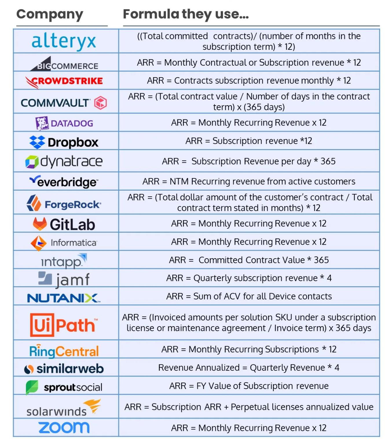
Borrowing KPIs from other products
I love this example from Mostly metrics: here are 20 ways to calculate ARR:
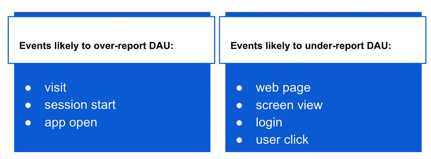
I’ve gone through 10 different definitions of DAU over the last 4 years— and most of them weren’t perfect:
People switch companies and bring their frameworks (based on specific metrics) with them without considering whether a weather channel success stories fit a nutrition tracking app. It doesn’t.
Some common mistakes senior analysts often make:
Bringing SaaS reporting into B2C subscription analytics. For example, ignoring trials or Trial-to-Paid CVR in subscription reporting. More on it here.
Using B2C transactional metrics in B2C subscription products, such as including not paying users in LTV or ARPU calculations or adding new users into churn metrics.
Bringing SaaS or B2B metrics into B2C, such as using churn to measure product abandonment or trying to measure inverted retention.
Each product type requires tailored metrics and frameworks that reflect its unique business model and user behavior.
Using the same KPI for different use cases
Every metric has its own purpose - whether it’s ecosystem, secondary, tradeoff, proxy, success, North Star, OMTM, etc. Developing (and maintaining) multiple variations of the same KPI and ensuring teams use it appropriately across different contexts is a real challenge.
For example, here are a few contexts on how to report churn:
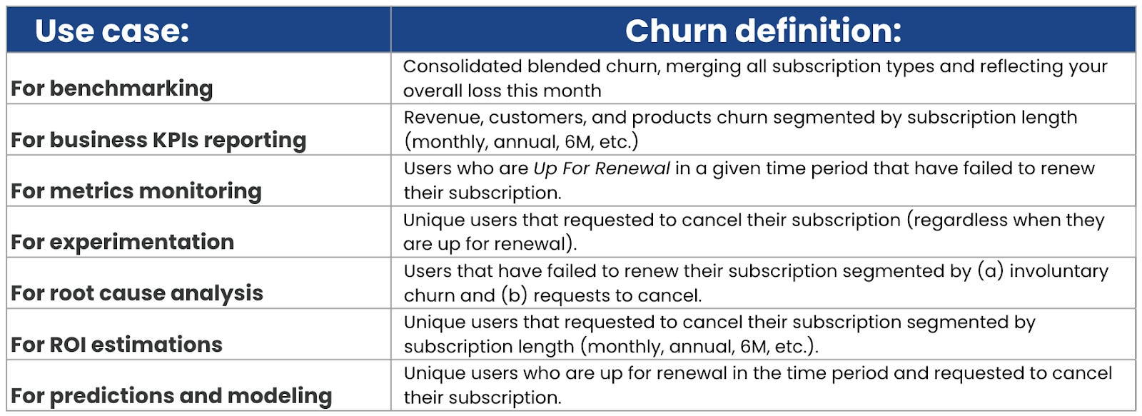
So, theoretically, I’d need to create at least 7 different calculations for one KPI, depending on who’s using it, when, and for what purpose. Good luck with semantic layers! And metrics trees! Let me know how that goes 😈
📝 I often see people debating the “right” way to calculate a KPI, arguing over which method is more accurate or appropriate - like whether to use bounded or unbounded retention, whether to exclude new users from DAU, or whether to exclude canceled trials from churn rate. The reality is, we actually need all of these KPI variations to fit different use cases.
Over-complicating metrics
I’m definitely guilty of this. As I mentioned earlier, when sensitivity is at play, you need metrics to be precise. You want to exclude edge cases like double-firing events, problematic timelines where data was affected, test users, etc. But chasing reporting accuracy often comes at the cost of making it more complicated.
For example, here’s the actual DAU definition I had to come up with for a productivity-tracking app:
DAU = session start (with session length capped at 45 min) + login (excluding unauthenticated users) + onboarding page view (excluding unauthenticated users) + CTA (login status = on)
It was super accurate and trusted. But replicating it across 5 data sources? Yeah, that was fun.
Another educational app I’m working with right now has many different features spread across the app, and their DAU was defined based on 11 unique events - some with additional filters. I can’t believe it’s been 4 months already trying to switch their reporting to a simpler approach while maintaining the same activity milestones.
It’s all about finding the balance between precision and ease of report maintenance. If you can, aim to keep KPI logic simple and intuitive. Limit the number of variables and calculations. This will help you:
Replicate the KPI across multiple platforms.
Reduce the probability of errors.
Facilitate iterations—because you’ll likely need to adjust your KPIs every few months.
So, don’t listen to everyone. Just do: DAU = app open + signup. You can thank me later.
Using the wrong proxies
Activating more streaks or sending friend invites doesn’t necessarily serve as a proxy for LTV or revenue. You need more analysis to prove the relationships between sensitive metrics and ecosystem metrics.
Examples of proxy metrics:
DAU: Unique screen view, Login, App open, Median time spent per user per day
Activation: Onboarding CVR, % users doing X activity in their first day.
Retention: Total screen views, Logins, App opens, Unique days users using the product/feature.
Install-to-Paid: Signup-to-Trial, Total trials, Number of initial transactions.
Churn rate: % users canceled, Total number of cancellations, Median time spent per user per day.
LTV: DAU-to-Paid, AVG transactions/orders per user, % paid customers from DAU.
Revenue, MRR: Total transactions, Paid customers, Upsell-to-Trial CVR, AVG revenue per user
How to determine if your proxy metric is effective:
The proxy metric should be sensitive enough to be influenced in the short term - such as screen views, button clicks, session time, or number of transactions.
Good proxy metrics are simple and don’t involve many complex filters or calculations.
The metric should be independent of other product features, marketing initiatives, or similar factors.
The change in the proxy metric should indicate the direction of change in the target metric.
Learn more about proxy metrics: Introduction To Proxy Metrics and How to find optimal proxy metrics.
Losing Proportions between KPIs
In last week’s publication, Mastering Critical Thinking: How to Improve Your Analytical Skills, I introduced the concept of measuring compounding:
A 25% increase in signups leads to a 1% increase in trials.
A 1% increase in trials translates to a 0.5% increase in paid subscriptions.
A 0.5% increase in paid subscriptions results in a 0.02% increase in revenue.
How do we calculate these?
It starts with understanding the ecosystem of metrics. All KPIs and metrics are interconnected. If one metric increases, you need to know which other metric may decline and by how much. That’s why we rely on waterfalls and funnels to measure compounding factors.
Examples of subscription metrics relationships:
High churn = low retention. The higher the churn, the lower the retention, and vice versa.
Total transactions = New subscriptions + Renewals.
Net new subscriptions = New subscriptions - Churn.
Examples of engagement metrics connections:
If 30% of users engage 2+ per week, the DAU/WAU ratio should be at least 60%.
If the WAU/MAU ratio is at least 60%, DAU/MAU should be over 20%.
If 40% of users activate the product during the first 24 hours, then R(Day 1) should be at least 50%.
And so on.
As I mentioned last week, in analytics, it’s rare to see a report that clearly states, “+20% increase in Signup-to-Trial CVR since 9/15/2024 attributed to X campaign.” If that were the case, we’d probably be out of a job.
Instead, what typically happens is this: Next to a +20% increase in Signup-to-Trial CVR, you might see a (-10%) decline in Signup-to-Paid CVR, a (-12%) drop in total trials in Amplitude, with Meta showing trials are up 560%, while GA is reporting flat signups, and Snowflake’s Downloads data is incomplete.
That’s why maintaining metric proportions and having clear baselines is essential. Even if you have low trust in reporting or things don’t seem to add up, understanding the movement of one metric can help you interpret the movement of another - bringing some much-needed confidence to your report.
Takeaways
Don’t overthink KPIs. If you're unsure how to measure an initiative, stick to simple metrics like unique views, CTA clicks, and the % of users with a CTA click. Not everything needs to be tied to LTV or MRR.
Use an effective proxy metric that is both sensitive and independent. If your proxy requires complex calculations, it’s not a good proxy.
Don’t stress about benchmarks - focus on your Signup-to-Paid MoM growth.
Avoid bringing metrics definitions from your previous job into your current project. Every product is unique, with different user lifecycles. Some apps have monthly and annual subscriptions, while others have 18 payment plans. Churn calculations will vary. Develop KPIs that fit this specific business and product.
Keep metric logic simple by minimizing the number of variables and calculations.
Thanks for reading, everyone!
Great article Olga. I've seen leaders following over-complicated KPIs for years. They didn't even know how to explain the calculations to their teams and everyone's performance was based on it. KPIs go beyond just a calculation, they have real implications. It matters that folks know what they exactly mean.